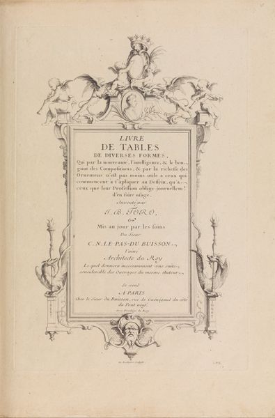
Title Page, from Bozzy and Piozzi by Peter Pindar, Esq. 1787
0:00
0:00
drawing, print, paper, typography
#
drawing
#
aged paper
#
neoclassicism
# print
#
hand drawn type
#
paper
#
typography
#
fading type
#
stylized text
#
thick font
#
handwritten font
#
golden font
#
classical type
#
historical font
#
columned text
Dimensions: Sheet: 9 3/8 × 7 3/16 in. (23.8 × 18.3 cm)
Copyright: Public Domain
Editor: Here we have "Title Page, from Bozzy and Piozzi by Peter Pindar, Esq.," created in 1787, currently held at The Met. It's a print on paper, mainly typography. It looks like a book's title page. What jumps out at me is the formality of the typography, yet there’s something slightly satirical about the title itself. How do you interpret this work? Curator: It’s interesting that you pick up on the satirical nature. Look at the historical context. Peter Pindar was a pen name for John Wolcot, known for his biting satires targeting the British elite. The title itself, "Bozzy and Piozzi," refers to James Boswell and Hester Thrale Piozzi, both biographers of Samuel Johnson. What power dynamics were at play here, in your opinion? Editor: Hmm, you mean considering their social standing and roles within the literary world at the time? Boswell’s biography is still very famous, and he had a certain…status attached to him. Curator: Exactly. Wolcot is challenging that established order, using humor to critique their works and, perhaps, their positions in society. Satire, in this period, often served as a vehicle for social commentary, holding power to account through ridicule. How does the typography contribute to this tension, in your opinion? Editor: Well, it uses very formal, almost neoclassical lettering, which seems to add to the humor by contrasting a formal style with a potentially mocking tone. I suppose this shows that on the one hand, the author might want to come across as "high art" to attract buyers, but at the same time be a sort of parody against people held in esteem. Curator: Precisely! The choice of typography is a critical component of the satire, acting as a visual representation of the societal norms being questioned. What I learned today from you is how powerfully the typography of older artwork contrasts the topic, emphasizing satire's important purpose.
Comments
No comments
Be the first to comment and join the conversation on the ultimate creative platform.
More like this