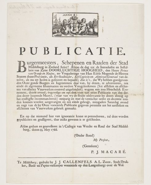
Tekst bij de rozen met silhouetportretten van Willem I Frederik, koning der Nederlanden, Wilhelmina van Pruisen, hun kinderen, zijn ouders en zijn zus 1815 - 1819
0:00
0:00
francoisjosephweygand
Rijksmuseum
graphic-art, print, paper, typography, engraving
#
portrait
#
graphic-art
#
neoclacissism
# print
#
paper
#
typography
#
engraving
Dimensions: height 218 mm, width 172 mm
Copyright: Rijks Museum: Open Domain
Editor: This print, titled "Tekst bij de rozen met silhouetportretten van Willem I Frederik..." and created between 1815 and 1819, features typography and engraving on paper. It’s part of the Rijksmuseum collection. I find the strict symmetry and borders quite striking. What catches your eye in this work? Curator: The engraving's formal structure is immediately apparent. Notice the mirroring of the text in both Dutch and French, framed by a border with repetitive floral motifs. The typography itself, particularly the use of varied font weights and sizes, establishes a clear visual hierarchy. It is also a document that seems to point towards something else. How does the structure point towards meaning? Editor: The structure highlights the dual purpose: an explanation in two languages, reinforcing its message to a wider audience and conveying some sort of significance and accessibility to a range of readers in different locations. It almost resembles official government language, seeking to communicate in all available forms. I imagine that the silhouetted portraits, which are not pictured, but referenced, serve a symbolic purpose, almost acting as ciphers within the overall composition. Curator: Precisely. The symmetry in language and the emphasis of royal names also suggests something more than personal connections. The portraits, though unseen to us in the engraving, reinforce themes of lineage and the structure of power during the rise of Neoclassicism and nation-state consolidation. Notice that there are nine portraits along the flower border, with both text boxes structured within very specific aesthetic conditions. We could say that the very rigid conditions are the primary aesthetic of the piece. Editor: I see it now – the piece seems like a study in structured messaging! Thank you for breaking down the elements; it's fascinating how the piece has all these underlying layers. Curator: Indeed! Sometimes the power lies not in what is depicted, but in how it is presented. This emphasis of aesthetic constraint reflects the complex relationship between the structure of art and cultural structures in society.
Comments
No comments
Be the first to comment and join the conversation on the ultimate creative platform.
More like this