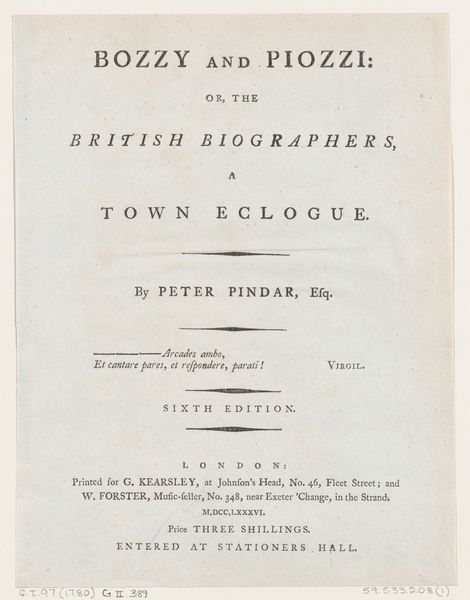
Frontispiece, from Peter's Prophecy, or The President and Poet, by Peter Pindar, Esq. 1786 - 1792
0:00
0:00
drawing, print, etching, typography
#
portrait
#
drawing
#
neoclassicism
# print
#
etching
#
typography
Dimensions: Sheet: 9 1/2 × 7 5/16 in. (24.1 × 18.5 cm)
Copyright: Public Domain
Editor: Here we have the frontispiece from "Peter's Prophecy, or The President and Poet" by Peter Pindar, published between 1786 and 1792. It’s an etching with typography, and it strikes me as quite austere, almost purely informational in its layout. What visual elements do you find most significant? Curator: The overall composition, of course. Observe the rigid hierarchy established by the varied typefaces. The title commands immediate attention with its large, bold lettering. Each line adheres to a strict centering, reinforcing the sense of order and rational design characteristic of Neoclassicism. Notice the considered use of empty space, carefully balanced to separate textual blocks. Editor: Yes, it seems every aspect, from the font choices to the leading, has been meticulously planned. Curator: Indeed. Typography takes on a form beyond mere utility; it is a deliberate aesthetic choice. It contributes significantly to the artwork's visual structure, its message. Do you find the composition dynamic or static? Editor: It definitely feels static. Is that sense of stillness a purposeful reflection of the subject matter or period? Curator: Precisely. The static quality mirrors the values often associated with institutions of that era: stability, tradition, and reasoned discourse. How does the etching beneath the title factor in? Editor: Well, honestly, I don’t really see it. My eye is drawn so much to the typography that the etching almost fades into the background. I wonder if it could have been a little less subtle? Curator: Interesting point! One could argue its subtlety compels closer inspection. Perhaps its role is not to dominate, but to provide a visual counterpoint to the textual framework. Editor: So, the text and etching aren't fighting for attention. It all adds up! I’ll definitely pay more attention to typography in prints going forward!
Comments
No comments
Be the first to comment and join the conversation on the ultimate creative platform.
More like this