drawing, ink
#
drawing
#
baroque
#
ink
#
geometric
#
calligraphy
Dimensions: height 320 mm, width 411 mm
Copyright: Rijks Museum: Open Domain
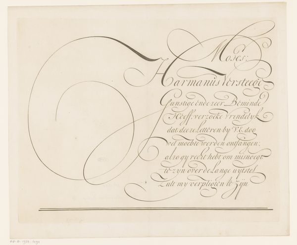
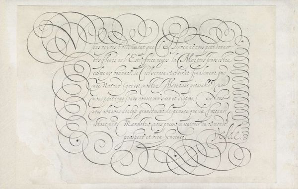
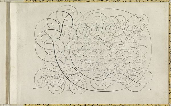
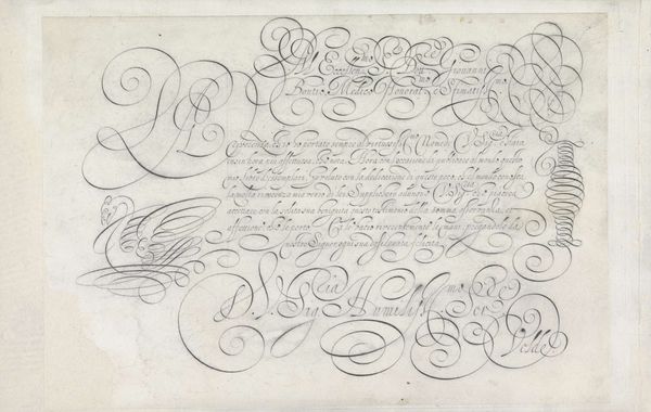
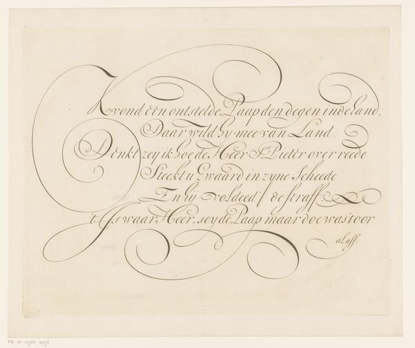
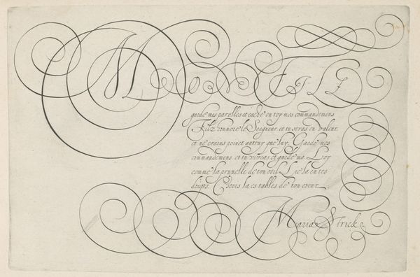
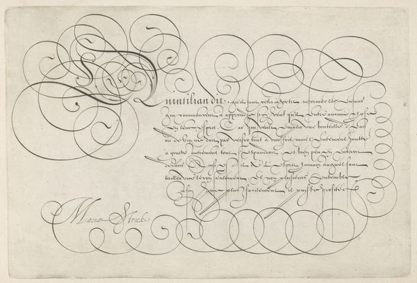
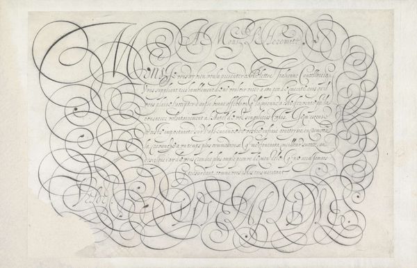
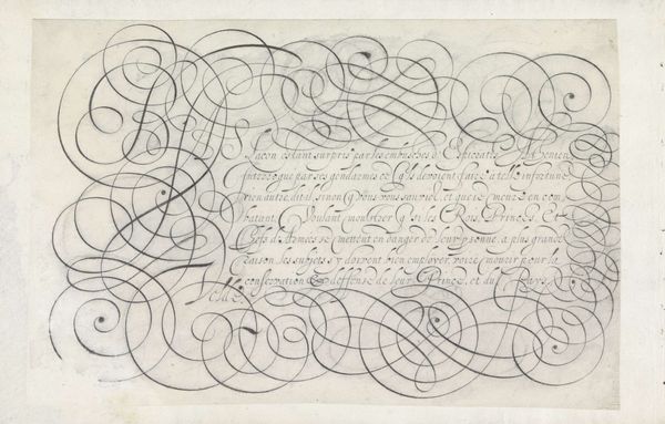
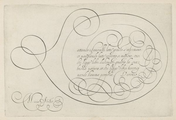
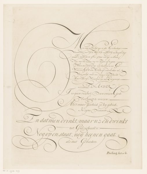
Editor: So, here we have "Schrijfvoorbeeld: Eersame gunstige vriendt (...)" a drawing in ink from somewhere between 1667 and 1718 by Ambrosius Perling. It’s mostly an example of Baroque calligraphy… it strikes me as remarkably decorative. What's your interpretation? Curator: It's tempting to see calligraphy simply as decorative, but I think we miss an opportunity if we don't consider its political and social context. Consider the development of standardized scripts during periods of state formation. How does controlled uniformity of script reflect—or impose—control in other areas of society? Is it an assertion of power? Editor: That’s… certainly a different angle than I considered. How does this relate to this particular drawing? Curator: Well, who was literate and who wasn't during this period? Calligraphy, as a highly refined skill, would have been largely confined to the upper echelons of society. So, the very act of creating and possessing such a piece becomes an assertion of social standing. The elaborate swirls, the flourishes… these are markers of exclusivity, signaling a degree of education and refinement inaccessible to the majority. Think of it as visual code, a way of maintaining hierarchical structures. What statement does the geometric design of the script evoke? Editor: So you are saying that the beautiful curves and shapes aren't just there to look pretty but to uphold a system of inequality? The geometric element almost enforces an idea of societal order. Curator: Precisely! It challenges the neutrality of aesthetic appreciation. Can we divorce artistry from its embedded social functions? Who benefits from the promotion of such artistic pursuits, and at whose expense? Editor: It’s kind of unsettling to think about it that way. I definitely learned a lot, viewing the beautiful geometric and refined skill from a hierarchical perspective is eye opening! Curator: Indeed! It calls into question our passive acceptance of historical styles, urging us to be critical about whose voices and experiences are amplified and whose are marginalized.
Comments
No comments
Be the first to comment and join the conversation on the ultimate creative platform.
More like this