Curatorial notes
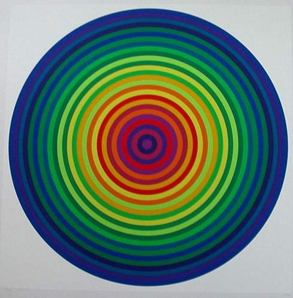
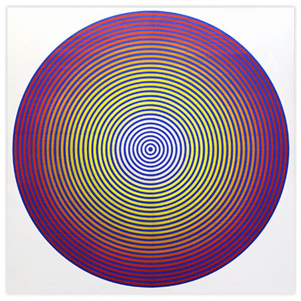
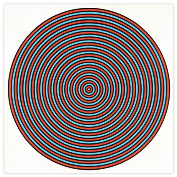
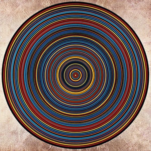
Curator: First off, this thing buzzes! I mean, visually. Julio Le Parc's "Composition S -14 - 4", dating from 1970. Acrylic, bold color, unapologetically vibrant. It kinda tickles the eyeballs. Editor: It certainly grabs your attention, doesn't it? Le Parc, with his roots in Kinetic and Op art, sought to destabilize the traditional viewing experience. This work epitomizes a moment when artists began questioning the passivity expected of the viewer, pushing boundaries. Curator: Passivity? There's no chance of passivity here. These rings are like… a cosmic drain circling counter-clockwise... maybe it's a portal, trying to suck me into the painting! And I dig it. Editor: Think about the era. The late 60s bled into the early 70s—full of social upheaval, demands for liberation. Op art's challenge to visual stability mirrors that desire to question established structures, political and social norms, you know? It reflects that push against what already exists. Curator: Ah, so this hypnotizing circle...is revolutionary. No pressure. I'm picking up what you're laying down, comrade! Editor: And notice how the concentric circles, rendered in vivid hues, seem to vibrate? That destabilization isn't accidental; it provokes an embodied response. It engages the viewer in a physical, not just intellectual, dialogue. What are the materials in relation to this effect? Curator: This has gotta be acrylic paint, right? That gives the colors a flatness... which somehow makes it more intense. Less distraction from texture means MORE punch-you-in-the-face optical sensation. Editor: Right, and the serial nature, too... that relentless repetition becomes its own form of protest, perhaps even an insistent rhythm calling for change. Le Parc certainly saw art as a means of direct social intervention. Curator: Direct, subtle...who knows, all I can say is that this work sparks the same sense of wonder that I felt when discovering a cool vintage LP cover for the first time... it draws you into a new dimension. Editor: Exactly. Looking closely, it presents an engaging tension between formalism and activism—the optical effect, the bold simplicity—it’s designed for active perception and demands questioning. Curator: Right! The thing seems kinda... hopeful? Like a sunrise maybe! Who knew geometric abstraction could be so damn life-affirming! Editor: Well, the artwork certainly presents new paths forward! It certainly did that for the canon!