Curatorial notes
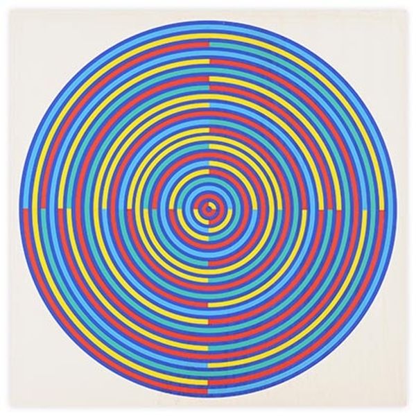
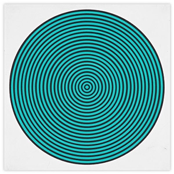
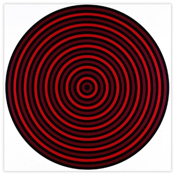
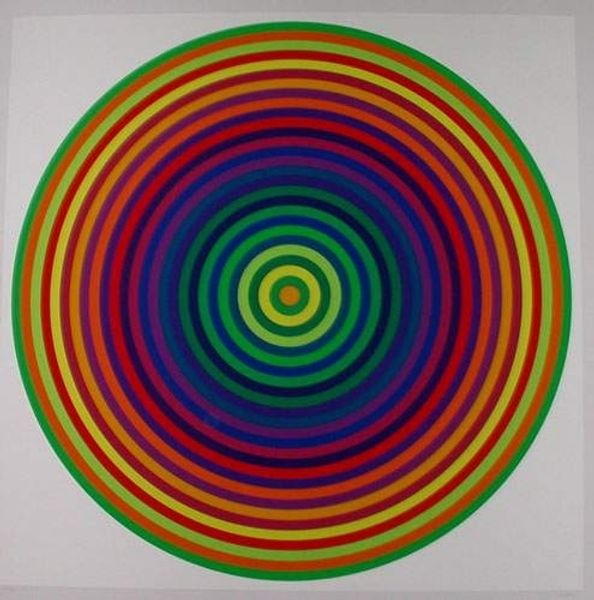
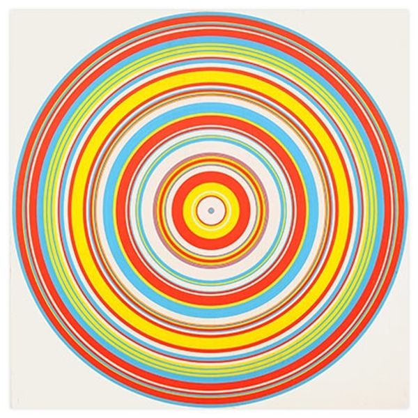
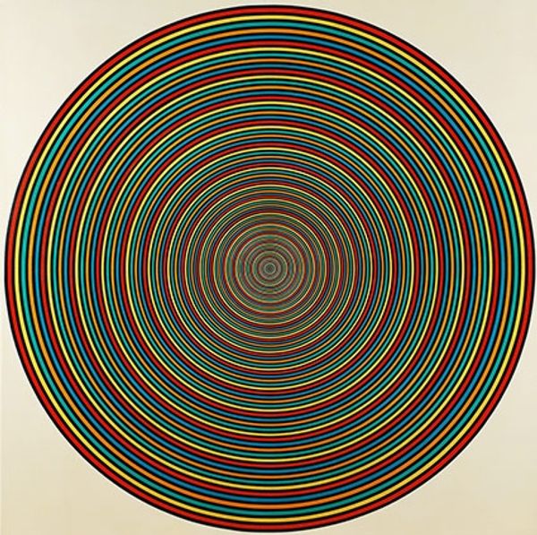
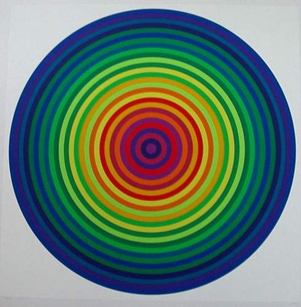
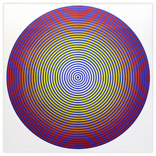
Curator: Let’s consider Tadasky’s "B 108" from 1964. The immediate effect is a bit dizzying, isn't it? All those concentric circles of blue and orange vibrate against each other. Editor: Dizzying is the perfect word. I feel like I'm being pulled into some kind of vortex, staring at it. But, I’m intrigued, tell me more, why did Tadasky craft such an attention grabbing image? Curator: Tadasky was deeply engaged with the Op Art movement, popular in the 1960s. It's all about exploring visual perception, and using geometric forms to create optical illusions. Op art certainly wasn't universally loved however, with figures like Clement Greenberg decrying the work. The critic had very precise and forceful views about what good and, in his eyes, useful art actually consisted of. Editor: Ah, yes, the tension between formalism and something else, always playing out! I’m immediately thinking about mandalas. This piece really reminds me of the visual devices used in meditative practices. Curator: That's fascinating. Could it be about achieving some sort of altered state? Certainly, there's a focus on repetition here, those precise lines creating a mesmerizing effect. The red and blue feel deliberately chosen to engage the eye, stimulating an almost visceral response. Editor: The concentric circles really drill down to a very basic archetype, that sort of circular symbolism appears across time and cultures representing the self and our interconnectedness with nature. Looking at it with 60's eyes in mind, maybe it also reflects back psychedelic experiences of altered perception. Curator: Absolutely, that cultural context of the '60s is crucial here. The whole "turn on, tune in, drop out" ethos certainly found a visual language within Op Art. But the piece's survival over time lies in it’s striking nature and symbolic strength I suppose, it asks us to look not just at art, but at how our senses can be so effectively tricked. Editor: In its stark simplicity and its powerful symbolism, B 108 has really stayed with me. The artist made a space here for our brains to feel really tripped out for a while. A bit of an unsettling and beautiful way to finish our tour, don’t you think? Curator: Yes, it encourages a healthy skepticism towards the image itself. After all, there is always a cultural setting that gives visual expression it's political undertones. It serves as an image in time while speaking across time!