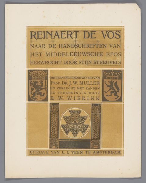
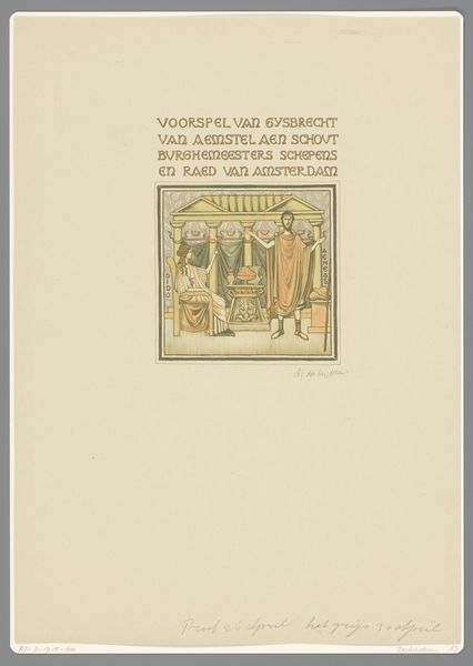
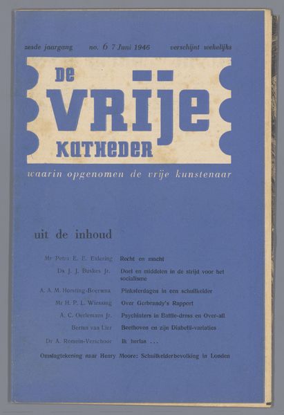
graphic-art, typography, poster
art-deco
graphic-art
typeface
typography
geometric
cityscape
poster
modernism
Dimensions: height 259 mm, width 171 mm, thickness 1 mm, width 342 mm
Copyright: Rijks Museum: Open Domain
This is the 1928 annual report for the University Library in Amsterdam, made anonymously through industrial printing techniques. Notice the geometric sans-serif typeface, and the symmetrical composition of the page. The black and orange colors are characteristic of the Art Deco style that was popular at the time, and speak to a sense of modernity and order. The design features a minimal use of decorative elements, arranged in horizontal and vertical lines. This streamlining reflects a broader social commitment to efficiency, typical of the period. The production of the report itself relies on the standardization of letterpress printing and binding: a combination of automated and manual labor that made information widely accessible to the public. This brings up questions of labor, class, and the increasing role of information in modern society. By examining the materials, making and context of this book, we can appreciate its significance as both a functional object and a reflection of its time, challenging distinctions between design, craft, and social history.
Comments
No comments
Be the first to comment and join the conversation on the ultimate creative platform.