print, typography, poster
printed format
typography
poster
publication design
Dimensions: height 19.5 cm, width 27 cm
Copyright: Rijks Museum: Open Domain
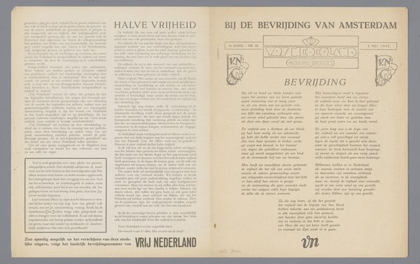
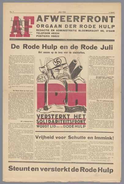
This broadsheet was made by Heierman & Co. in June 1945, and if you look closely, you will notice that it’s a feast for the eyes, playing with our perception through various shapes and sizes. I love the way the designer uses two primary colors to create a bold, graphic statement, a visual punch. The use of such a limited palette forces us to focus on the forms themselves. It's like a drawing where the lines define not just the shapes, but the whole composition. The fragmented letters at the bottom of the title, ‘feestnummer’, look as though the designer is pushing against tradition, breaking apart the clean lines. It is almost like a precursor to the cut-and-paste aesthetic found in contemporary zines. This technique also mirrors the fractured state of post-war Europe as a whole. This bold and expressive style reminds me a little of early Dadaist experiments. It’s a reminder that art is always in conversation with itself. It’s a messy, ongoing dialogue, full of questions rather than answers.
Comments
No comments
Be the first to comment and join the conversation on the ultimate creative platform.