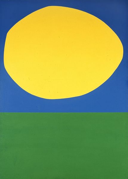
Copyright: Sadamasa Motonaga,Fair Use
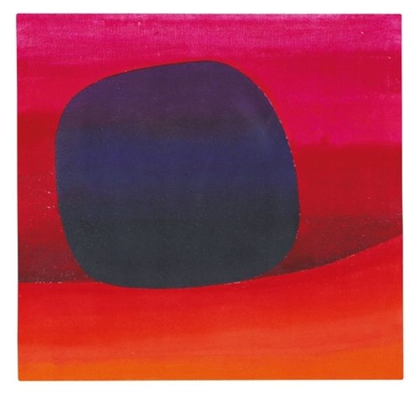
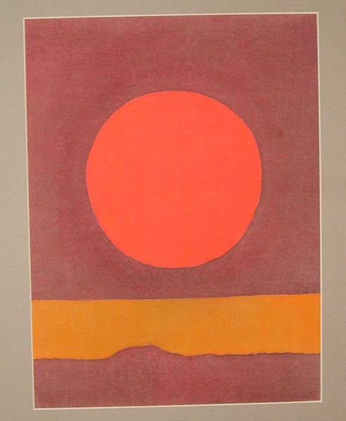
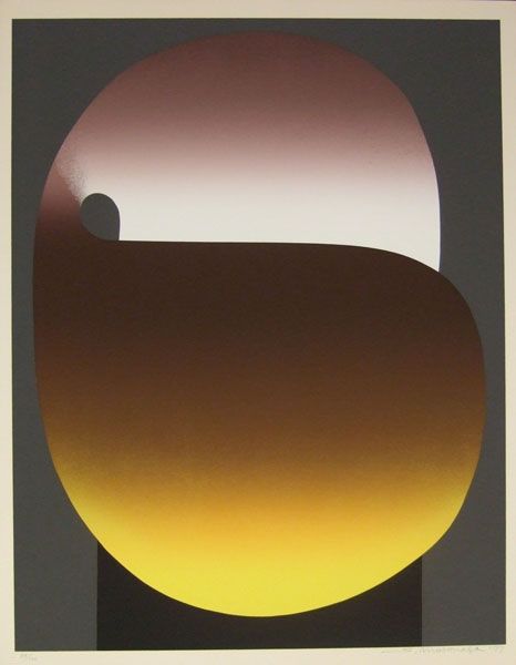
Curator: The simplicity is what grabs me. Looking at Sadamasa Motonaga’s "In The Orange Color" from 1977, painted with acrylic, I’m struck by this very graphic, almost screen-printed aesthetic. What’s your immediate read on it? Editor: It has an undeniable playfulness. The bold geometry against those slightly clashing, candy-colored gradients—orange fading to purple—creates a tension. And then this massive form looming, grounded by what could be water and earth, but distilled, right? I'm wondering about the traditions Motonaga might be in dialogue with here, historically. Curator: Absolutely, he emerged from the Gutai movement in postwar Japan. While they’re famous for performative pieces, Motonaga pushed the boundaries of form, thinking about what defines painting. I see in “In the Orange Color” this pursuit distilled down to its essence. The looming darkness that feels massive yet weightless. Perhaps speaking to his concerns for environmental issues, or perhaps societal oppression? Editor: You mention societal oppression - it makes me consider the relationship of Gutai to other artistic movements responding to such widespread change, politically, artistically, across that period. And I wonder, looking at it, what kind of audience would this have spoken to, with its visual punch? The combination of bold colors and minimal shapes aligns well with Pop Art's popular appeal but here the pop has some more melancholic implications. What symbols might linger for audiences viewing this, symbols connected to place and environment? Curator: The gradient is also key. It denies any easy reading of horizon. We lack context to fix ourselves; only the looming shape persists. It acts like an elemental form, carrying with it all these accumulated symbols that speak about the weight and power of the unknowable. Motonaga reduces, perhaps even dares us, to ask profound questions without easy answers. Editor: The color palette feels both nostalgic and unsettling, recalling commercial palettes while hinting at something immense, almost primordial. It challenges assumptions and, in its odd serenity, compels us to feel and question. What lasting echoes do you sense for contemporary viewers? Curator: In its reduction to shape, color, and mood, “In the Orange Color” speaks to something elemental and timeless, leaving one to grapple with form, feeling, and the shadows we each bring.
Comments
No comments
Be the first to comment and join the conversation on the ultimate creative platform.
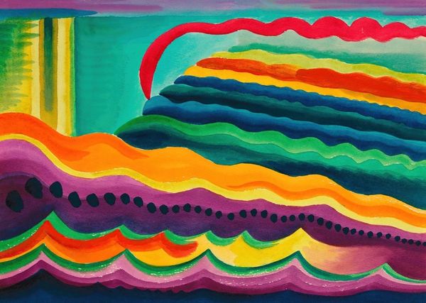
More like this