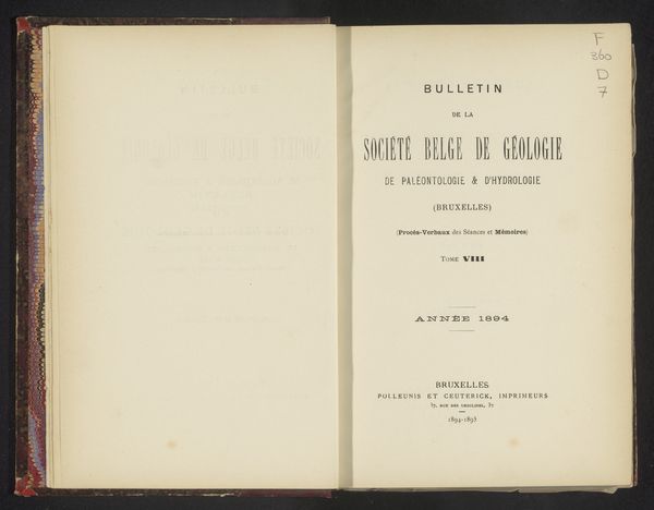
Bulletin de la Société belge de géologie, de paléontologie et d'hydrologie 1887
0:00
0:00
graphic-art, print, paper, typography
#
graphic-art
#
16_19th-century
# print
#
paper
#
typography
#
coloured pencil
Dimensions: height 250 mm, width 174 mm, thickness 38 mm
Copyright: Rijks Museum: Open Domain
Curator: Here we have "Bulletin de la Société belge de géologie, de paléontologie et d'hydrologie", a print dating back to 1887 by Polleunis et Ceuterick. My initial thought is, 'elegance'. A restrained, balanced design. Editor: My immediate reaction is a bit different. It looks aged, almost brittle. The materiality of the paper jumps out, its potential for decay. And, considering it’s a geological society bulletin, the labor involved in its creation interests me - the paper production, printing, and distribution within that specific scientific community. Curator: True, the physical properties do speak to age, but observe how the typography anchors the composition. The varying font sizes create a hierarchy, drawing your eye from "BULLETIN" to the society's name. It’s about guiding the reader visually. Editor: For me, it's equally about the unseen labor, how information circulated at the time, who had access to this bulletin and knowledge. It represents a stage in the production and consumption of scientific discourse, its design and distribution a testament to particular material conditions. I think how the geological information here helped shape our perception of Earth, which further facilitated natural resource exploitation. Curator: That's a very materialist perspective. I still find the use of varied typesetting to add depth and articulation. The way they break up the sections by font and font sizes draws the reader in effectively. Editor: And this careful organization allows for its findings to become available for a more consumerist scientific appetite. It has moved knowledge production, and labor further and further apart. It allows people at higher levels to profit. This division has a political nature. Curator: I think its visual choices represent this search of objectivity that science in the 19th century was trying to pursue. This separation through visual communication is more efficient. Editor: Indeed. We are on the precipice of the birth of corporate logos and identity packages that will control labor and branding in a total way. I find it is interesting to think that a Geology publication might show this tendency and be the starting point of design. Curator: Ultimately, both the form and the potential social impacts you’ve addressed show the thought and expertise, the beauty and efficiency of graphic works like this. Editor: I agree. Looking beyond aesthetic considerations reveals complex webs of production, labor, and historical scientific progress.
Comments
No comments
Be the first to comment and join the conversation on the ultimate creative platform.
More like this