Report of the State Board of Health upon the sanitary condition of the Neponset meadows in the towns of Canton, Sharon, Norwood, Dedham, Milton and Hyde Park: 1897 1897
0:00
0:00
graphic-art, print, textile, paper, photography, typography
#
graphic-art
#
type repetition
#
aged paper
#
paper non-digital material
#
paperlike
# print
#
textile
#
personal journal design
#
paper texture
#
paper
#
photography
#
typography
#
folded paper
#
embossed
#
thick font
#
letter paper
#
calligraphy
Dimensions: height 233 mm, width 144 mm, thickness 8 mm
Copyright: Rijks Museum: Open Domain
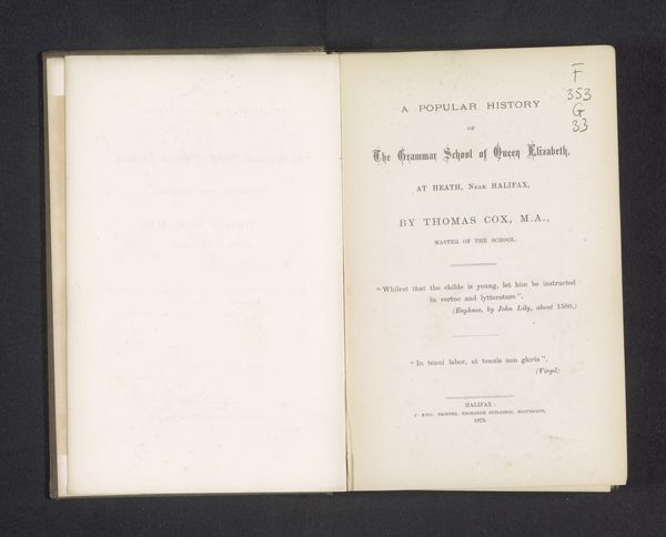
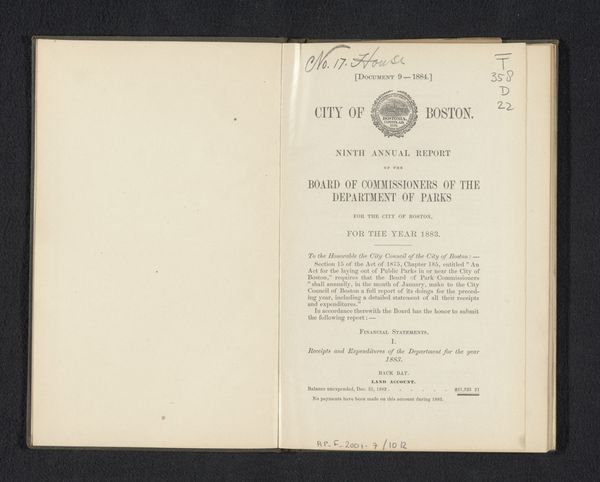
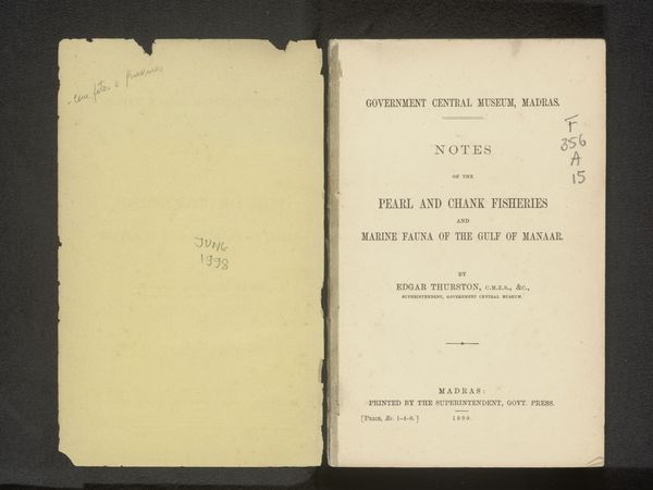
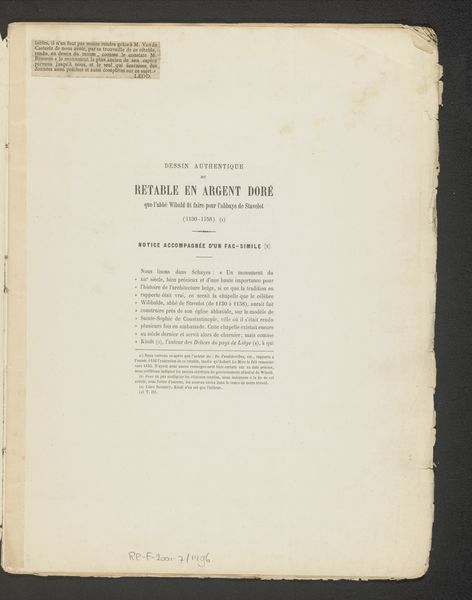
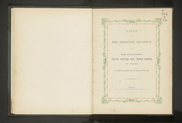
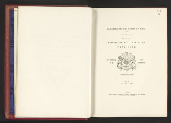
Curator: Here we have the cover page from "Report of the State Board of Health upon the sanitary condition of the Neponset meadows in the towns of Canton, Sharon, Norwood, Dedham, Milton and Hyde Park," published in 1897. Editor: My immediate thought is of austerity. The color palette is constrained to shades of sepia, giving it a sense of age, and the rigid typography only reinforces the sternness. Curator: Indeed, the design aesthetic reflects a time prioritizing function over ornamentation. Look at how the text is organized: hierarchical emphasis achieved via variations in font size and weight. Note, also, the crisp lines that delineate text blocks against the vast, almost tactile page. Editor: Absolutely. Public documents like these played a significant role in shaping civic life, didn’t they? I imagine reports like these influenced public policy and spurred environmental regulations within those Massachusetts towns. Curator: Precisely. Beyond the document itself, consider the implications. Public health became a central focus in the late 19th century, marked by efforts to regulate industry and urban planning for hygiene, revealing anxieties of the era around public welfare. The placement of Wright & Potter as "State Printers" situates their company within an established institution of government. Editor: And the typeface—it's clean, functional. The slight imperfections visible across the page underscore its production process, a stark contrast to modern, seamless digital outputs. It almost invites closer inspection to decode not just its explicit message but also its silent one. Curator: Good observation; even the texture of the paper has an element of intentionality. Paper stock held connotations; decisions that informed perception as a credible document to disseminate throughout society. Editor: Analyzing the material conditions really deepens one’s appreciation, doesn't it? We’re not merely observing historical data but decoding artifacts embodying values and practices of their age. Curator: It serves as a good example how we derive meaning through the sum of parts of a particular print. The interplay between the typography, composition, and historical context informs and enriches our perception.
Comments
No comments
Be the first to comment and join the conversation on the ultimate creative platform.
