graphic-art, print, paper, typography
#
graphic-art
# print
#
woodcut effect
#
paper
#
typography
#
line
Dimensions: height 230 mm, width 151 mm, width 302 mm, height 140 mm, width 95 mm
Copyright: Rijks Museum: Open Domain
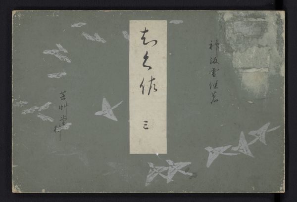
This is an anonymous English calendar for 1915, and it’s interesting to look at this cover, especially if you're a painter, because it's all about the line. The whole image is created through these fine, delicate lines; they build up the images of the crane, the waves, and even the text itself. It's really like the whole thing is drawn, which makes it feel really intimate and personal, right? I love how the artist let the lines accumulate to define the contours of the birds, not hiding, but rather emphasising, the physicality of the mark. It's not about trying to trick you into thinking it's real; it's about the act of drawing itself. This piece reminds me of some of Matisse’s graphic work in its simplicity, and the way it captures a sense of lightness and movement. Ultimately, art's about that conversation across time, those echoes and resonances, where meaning keeps shifting and evolving.
Comments
No comments
Be the first to comment and join the conversation on the ultimate creative platform.
More like this