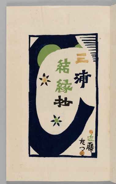
graphic-art, print, poster
#
graphic-art
# print
#
poster
Dimensions: height 254 mm, width 184 mm
Copyright: Rijks Museum: Open Domain
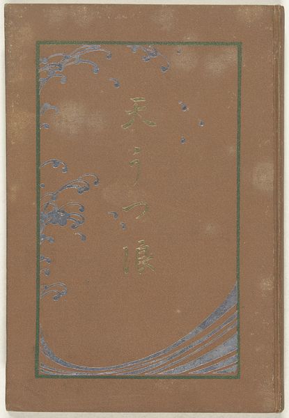
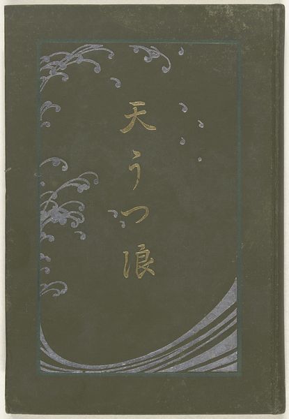
Editor: This is the cover of "Imperial Illustrated News Magazine" published between 1905 and 1912, likely a print. I'm really drawn to how the artist balanced Japanese and Western design elements. What stylistic aspects stand out to you? Curator: The synthesis is compelling. Observe how the flat planes of colour, characteristic of ukiyo-e prints, coexist with the sinuous lines of Art Nouveau, a style then burgeoning in Europe. Note also the considered arrangement of text, integrated within the visual field, rather than simply superimposed. How does the typography guide your reading of the image? Editor: It feels like the text isn’t just informative; it’s another design element, weaving together the Japanese characters and English lettering. It unifies the image instead of cluttering it. It enhances the contrast with curvilinear elements. Curator: Precisely. Semiotically, the typeface chosen subtly reinforces the message of modernization and internationalization that such a magazine might embody. Consider the interplay between the organic forms – the daffodils – and the geometric abstractions of the water patterns above. Does this tension contribute to its overall impact? Editor: Absolutely, the contrast keeps the eye moving. There's an energy in that balance. And I like the almost muted colour palette. Curator: It’s a calculated decision. What could have been garish is instead harmonious. Ultimately, it is a wonderful convergence of cultural aesthetics, perfectly capturing a moment in time. I never really took into account how every decision in the image affects the composition as a whole. Editor: Yes, this magazine cover illustrates such a subtle dialogue between cultural tradition and new approaches to aesthetics.
Comments
No comments
Be the first to comment and join the conversation on the ultimate creative platform.
More like this