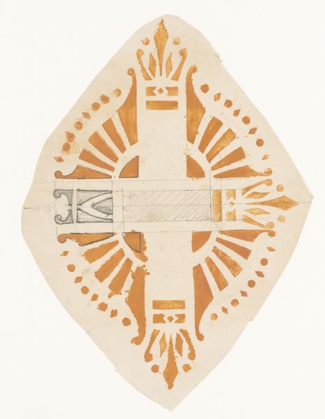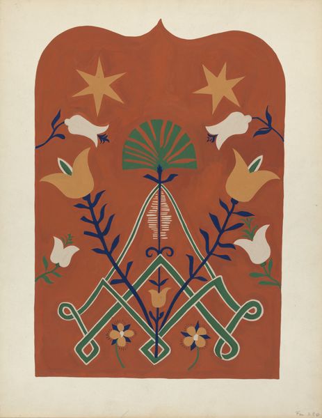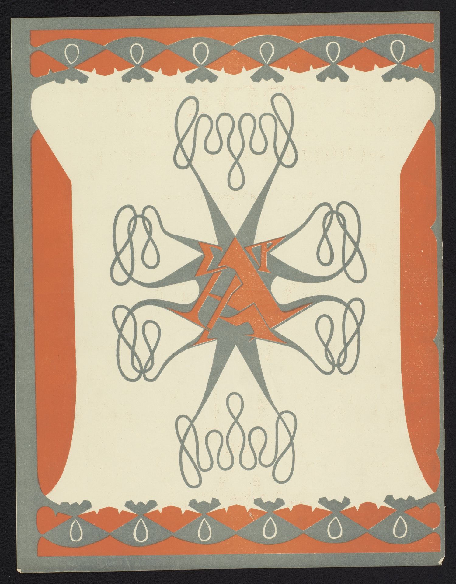
1899
Achterzijde van het omslag voor: De architect. Plaatwerk van Architectura et Amicitia
Listen to curator's interpretation
Curatorial notes
Curator: Well, let's consider Mathieu Lauweriks' poster from 1899. The title is a mouthful: "Achterzijde van het omslag voor: De architect. Plaatwerk van Architectura et Amicitia" -- basically, "Back of the Cover for 'The Architect', Plate Work by Architecture and Friendship." It's an Art Nouveau design. Editor: My initial impression is of organized chaos! The twisting lines fight against the rigid geometric structure. And the restricted palette gives it a really modern, almost austere feeling. Curator: Right, the color choice is quite deliberate, isn’t it? These are industrial colors -- muted orange-red, greys. You can see the limitations of cheap printing actually dictating the artistic direction. Notice also the abstracted symbols Lauweriks employs; the repetition in the border for instance suggests classical ornamentation but manufactured, democratized in some way. Editor: Exactly. What's interesting to me is the central symbol; it feels vaguely alchemical, the geometric arrangement of radiating lines seems to be a sort of emblem. Then those looping, knot-like forms attached seem almost like decorative appendages that suggest constraint or containment of these sharp rays. Is he using these shapes to signal something specific, or are they more about conveying a feeling of contained, organized energy? Curator: The tension between order and ornament is a core feature of Art Nouveau itself! It suggests a controlled burgeoning, where the wild growth of natural forms is refined through industrial processes for everyday consumption, in affordable graphic design like this one here. It challenges assumptions about high art, doesn’t it? This cover was, after all, meant for mass distribution. Editor: Yes! This symbol almost feels like an invocation. But invoking what? Industrial progress, perhaps, channeled into architectural innovation and presented under the auspices of brotherhood! Fascinating blend of cultural yearning for something solid with the excitement of new material production. Curator: I’m left thinking about access: mass-produced art meant to be circulated widely. The architectural movement needed a mouthpiece; cheap graphic work served the role well, just as any other machine. Editor: I see it now also as a reminder, not every message needs explicit form. Sometimes symbols bypass language to tap directly into something older, even while promoting something new.