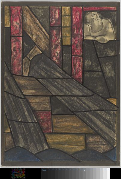
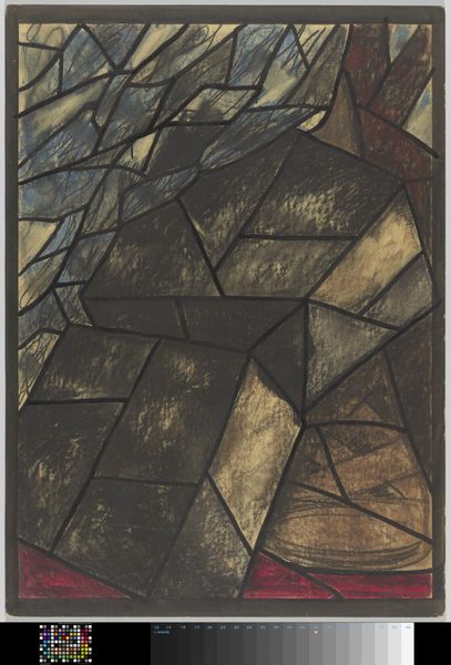
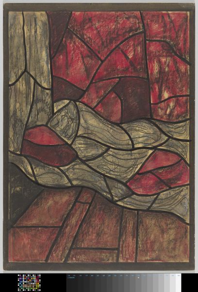
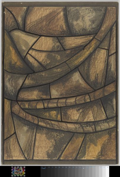
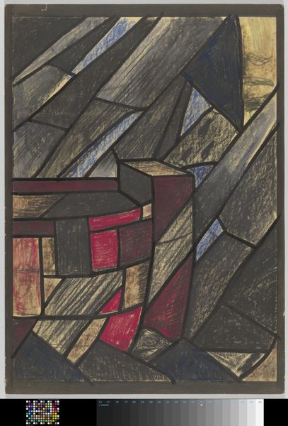
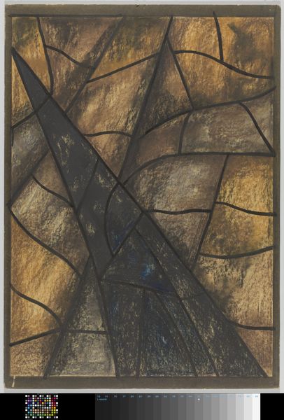
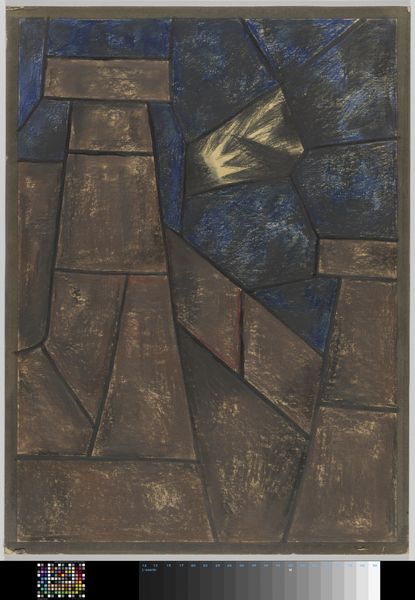
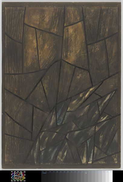
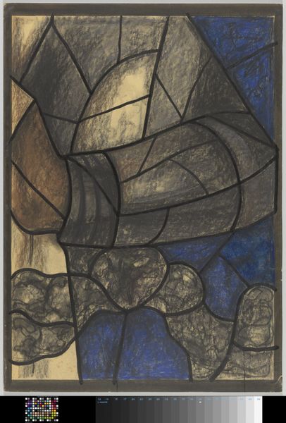
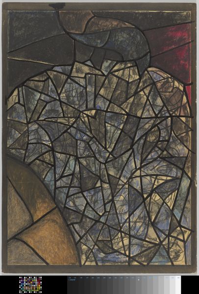
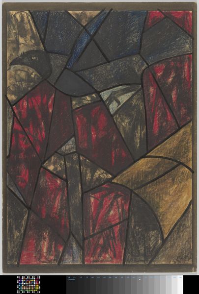
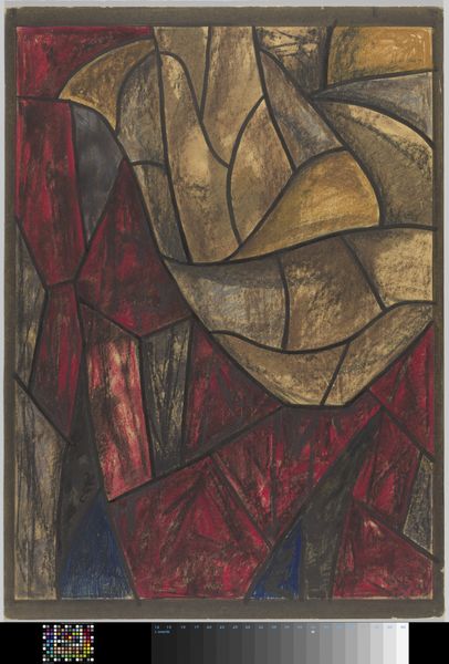
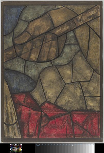
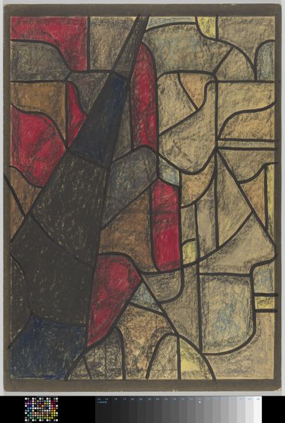
Ontwerp voor raam in het Noordertransept in de Dom te Utrecht c. 1934
richardnicolausrolandholst
Rijksmuseum
drawing, mixed-media, stain, paper, ink
drawing
mixed-media
toned paper
stain
paper
ink
tile art
geometric
mixed media
watercolor
Dimensions: height 1123 mm, width 809 mm
Copyright: Rijks Museum: Open Domain
Editor: This is Richard Nicolaüs Roland Holst's "Ontwerp voor raam in het Noordertransept in de Dom te Utrecht," a mixed-media drawing from around 1934, currently at the Rijksmuseum. It's a preparatory design for a stained-glass window, and I'm immediately struck by its somber tone, and the tension between geometric shapes and the organic feel of the brushstrokes. What compositional elements stand out to you? Curator: The interplay of line and field is crucial here. Notice how the heavy, dark lines don’t simply delineate forms but become active participants in the composition, creating a powerful sense of depth and spatial ambiguity. The angularity speaks to a dynamic fragmentation. Do you perceive how the lines relate to each other? Editor: Yes, the dark lines intersect at various angles, almost creating separate planes, but there is also an integration, because each one is a piece of the final design for the window. And that singular, red shape? Curator: Indeed. That flash of color disrupts the monochromatic scheme, immediately drawing the eye and acting as a focal point. The red also presents a crucial element, serving to unbalance an otherwise complete symmetry. Editor: I see what you mean. It prevents the work from feeling static or predictable. Did Roland Holst use specific techniques to give those brown and yellow blocks the effect of looking illuminated? Curator: Notice how the artist modulated the tone of each form and how their intersections created a particular interplay that is essential to our visual perception and cognitive grasp of the complete design. The varying thicknesses, in addition, subtly evoke the effect of light filtering through actual stained glass. This design's careful color modulation invites one's deeper engagement and meditation. Editor: That's a wonderful way to put it! I hadn’t considered how the tones alone could suggest that effect. It's more than just a design; it's a study in light and shadow. Curator: Precisely. Looking closely, considering the visual and the formal relationships, elevates our experience with the design.
Comments
No comments
Be the first to comment and join the conversation on the ultimate creative platform.