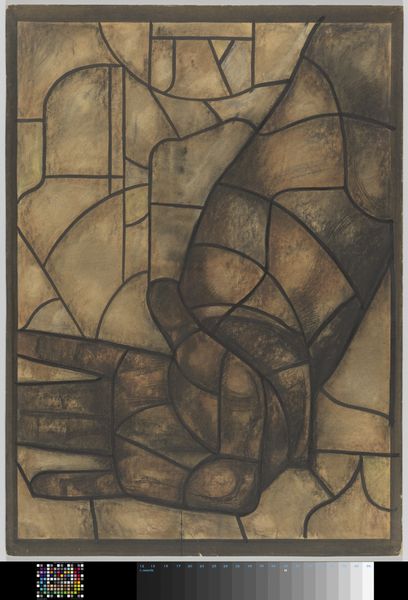
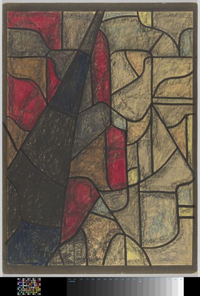
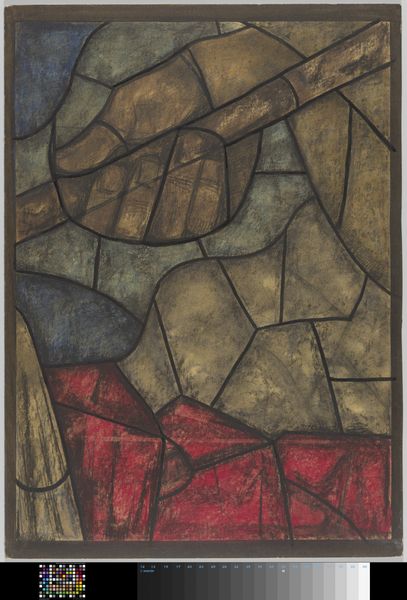
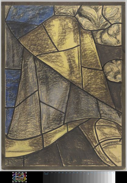
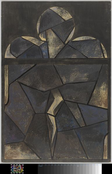
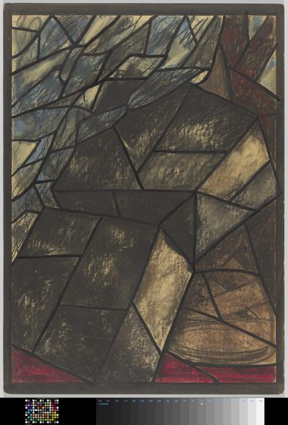
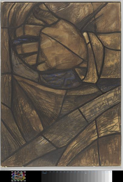
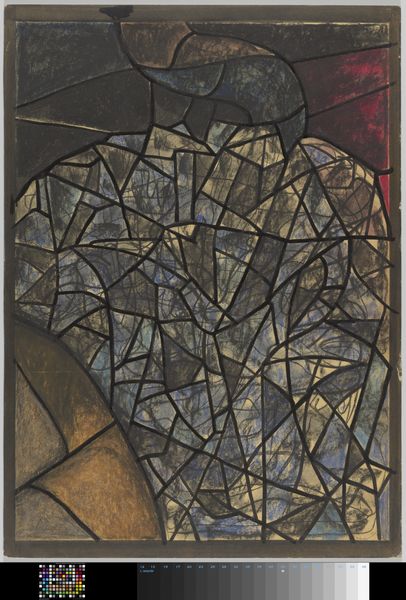
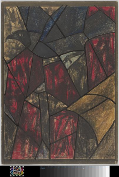
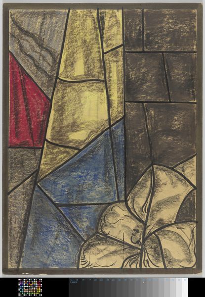
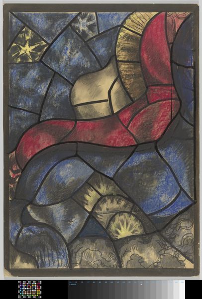
Ontwerp voor raam in het Noordertransept in de Dom te Utrecht c. 1934
richardnicolausrolandholst
Rijksmuseum
natural stone pattern
naturalistic pattern
toned paper
abstract painting
tile art
fluid art
abstract pattern
wooden texture
natural texture
layered pattern
Dimensions: height 1124 mm, width 809 mm
Copyright: Rijks Museum: Open Domain
Editor: This is "Ontwerp voor raam in het Noordertransept in de Dom te Utrecht," a design for a window in the Utrecht Cathedral, created around 1934 by Richard Nicolaüs Roland Holst. It's currently held at the Rijksmuseum. The bold black lines give it a very graphic, almost stained-glass feel, despite being a drawing on toned paper. How would you interpret its visual composition? Curator: The composition presents an intriguing interplay between geometric abstraction and the suggestion of organic forms. The dark, assertive lines delineate fragmented shapes, creating a dynamic tension across the picture plane. Note how the artist employs a limited palette—primarily blues, grays, and creams—to further emphasize the structural elements. How do the color choices impact the overall effect, in your opinion? Editor: The colors definitely add to the somber and monumental quality. The blue feels especially important, acting as a backdrop that both recedes and pushes forward due to its intensity. Curator: Precisely. And observe the handling of light and shadow within each defined section. The artist avoids uniform application, instead opting for subtle gradations that contribute to the illusion of depth. Consider the implications of the overall design in its intended context, as a window within a cathedral. Editor: It seems like the design might filter light in a way that creates a contemplative or perhaps even awe-inspiring atmosphere. I guess, to me, it's less about narrative and more about how the interplay of light and form would impact the space. Curator: An astute observation. The emphasis clearly rests on the aesthetic experience fostered by the inherent qualities of the design itself, rather than any external narrative associations. What have you learned from analysing this design? Editor: I hadn’t thought of how light is actually a material to work with when designing a window, and thinking about this has made the drawing far more engaging to me.
Comments
No comments
Be the first to comment and join the conversation on the ultimate creative platform.