etching, engraving
#
portrait
#
narrative-art
#
baroque
#
etching
#
landscape
#
group-portraits
#
genre-painting
#
history-painting
#
engraving
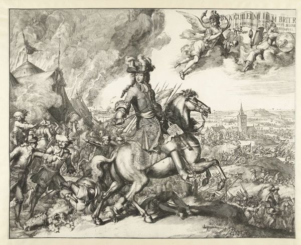
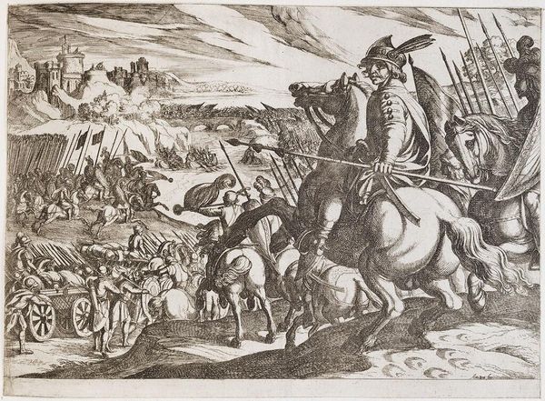
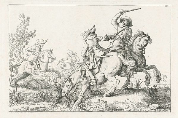
Dimensions: height 556 mm, width 423 mm
Copyright: Rijks Museum: Open Domain
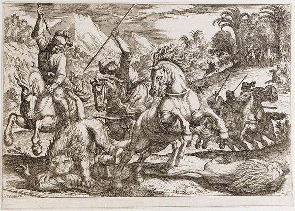
Editor: This is the left half of “Slag bij St. Denis,” or "Battle of St. Denis" created in 1678 by Romeyn de Hooghe, an etching and engraving that’s housed at the Rijksmuseum. It feels… chaotic, with the densely packed figures. What story do you think this print is trying to tell? Curator: Oh, I think it whispers of power, duty, and the sheer theater of war. You know, battles were as much about making a statement as they were about territory. De Hooghe, with his etching, captures that perfectly, doesn't he? This isn’t just reportage; it’s crafted spectacle. Who do you think those figures on horseback represent? Notice their clothing! Editor: Well, their fancy hats, and their regal bearing… they must be leaders. Aristocrats? Curator: Absolutely! Leading from the front—or at least, giving that impression! The fallen figures at the bottom make quite a contrast, a sombre note in all that pomp. Makes you wonder, doesn’t it, about who’s writing history—and from whose perspective. What's captured your attention? Editor: The sheer amount of detail. I mean, it's an engraving! But the depth he creates with all that cross-hatching is quite astonishing. And all the faces. The expressions seem really... human. Curator: Precisely. It's in those 'human' details – fear, bravery, pain - that a work really begins to breathe. Think of all the layers he etched! You have this large overview shot alongside such intense depictions of individual struggles… the overall affect pulls you into the chaos of it all, while maintaining clarity. What is it about the technique that strikes you as most important here? Editor: The cross-hatching gives the figures volume and makes their emotions seem more real. That the battle and background figures aren’t as detailed almost makes them appear transparent… giving us focus. Curator: Ah, transparent. A nice, interesting metaphor, capturing, I believe, just how this work blurs the lines between memorializing glory, and reminding us of life's transience. Editor: Definitely a lot to think about when we reflect on history and how it’s presented through art.
Comments
No comments
Be the first to comment and join the conversation on the ultimate creative platform.
More like this