graphic-art, print, poster
#
graphic-art
#
art-nouveau
#
hand-lettering
# print
#
hand drawn type
#
hand lettering
#
figuration
#
line
#
decorative-art
#
poster
Dimensions: height 136 mm, width 211 mm
Copyright: Rijks Museum: Open Domain
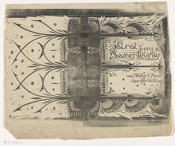
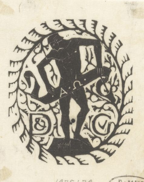
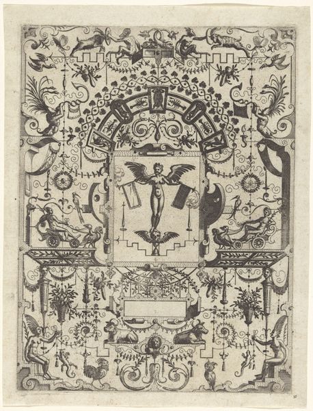
Curator: Here we have a poster titled "Advertentie van C.B. Schneider Behangselpapieren," created sometime between 1896 and 1935, by Mathieu Lauweriks. It’s a print, an advertisement actually, rendered in graphic art style that clearly demonstrates elements of Art Nouveau. Editor: The figures immediately strike me. The use of silhouette gives them a monumental quality. And, like architectural caryatids, they shoulder this ornate text block...which is advertising wallpaper? There's an interesting tension there. Curator: Absolutely. Lauweriks had very clear ideas of form that came from mathematical theory, expressing himself through the symmetry, balance and the geometrical patterns he was obsessed with. We can even go as far as seeing these recurring motifs as visual talismans he imbued in the work. Note how the shapes interplay - squares, circles and the spirals in this image, creating a visual echo chamber of his thoughts on harmony. Editor: So, it’s more than just decoration? The figures, especially given the time frame, are reminiscent of the idealised body prevalent in European thought at the turn of the century. The artist suggests associations with strength, and almost superhuman effort, applied to, well, wallpaper. Curator: Exactly. It suggests quality, reliability, a brand you can trust. The human figures function as archetypes—universal carriers. Each visual element holds symbolic weight, from the strong geometric shapes to the precisely placed lettering. Consider, too, how those repetitive patterns might create a sense of reassurance, a subconscious comforting rhythm, for a potential buyer. Editor: A promise of stability and aesthetic order during a period of massive social and artistic change. This print reminds me how even seemingly simple commercial art can subtly enforce dominant cultural narratives. Thank you, Lauweriks, for so openly portraying what shapes society, inside the literal domestic interiors the image sells. Curator: I'm glad we were able to unfold layers within what could be perceived as just a regular poster. Editor: Absolutely, a fascinating reminder that art doesn’t exist in a vacuum. Even something as functional as an advertisement can serve as a potent historical and cultural artifact.
Comments
No comments
Be the first to comment and join the conversation on the ultimate creative platform.
More like this