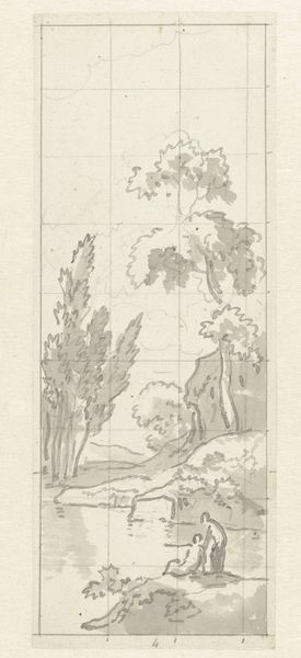
Ontwerp voor behangselschildering voor T.A. van Iddekinge c. 1752 - 1819
jurriaanandriessen
Rijksmuseum
drawing, ink, pen
drawing
neoclacissism
pen sketch
landscape
form
ink
line
pen
academic-art
Dimensions: height 282 mm, width 125 mm
Copyright: Rijks Museum: Open Domain
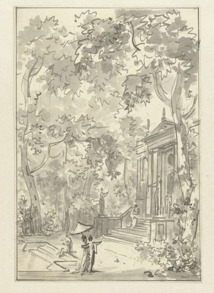
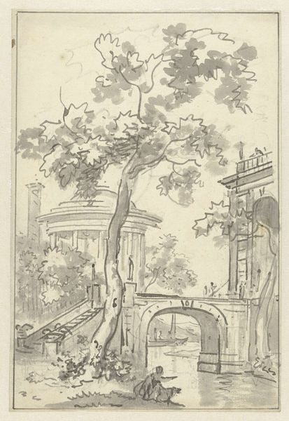
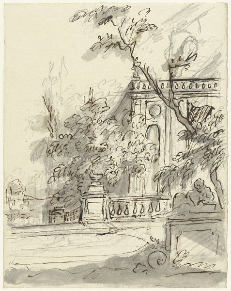
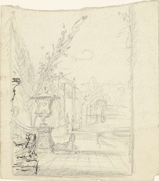
Curator: Here we have "Ontwerp voor behangselschildering voor T.A. van Iddekinge," a pen and ink drawing by Jurriaan Andriessen, dating from around 1752 to 1819. It resides in the Rijksmuseum. Editor: My initial response is that there's a curious tranquility conveyed by the subdued palette, but the architectonic structure creates a dialogue of power dynamic with nature, if that makes sense. Curator: The artist certainly had a keen sense of structure. We observe in Andriessen’s rendering of line a conscious adoption of academic principles in service to Neoclassical form. Note, if you will, the calculated repetition of line that reinforces both literal and metaphorical forms in landscape, but also, a subtle tension that can be observed via deconstruction. Editor: Andriessen’s work here shows how the aspirations and social status of the elite informed interior decoration. Wealthy families, like T.A. van Iddekinge, would have commissioned such designs to create impressive and refined domestic spaces. It's all about visually manifesting one’s position in society. The statues and column speak of control. Curator: Indeed. These design elements underscore, materially, ideological orientations toward an aspiration of higher and regulated tastes. Let us dwell for a moment, though, on the balance of form. Can we decode that as itself reflecting control—stylistically, a control asserted on its representational function as a drawing of architecture for decorative purposes? The drawing isn't a monument of great beauty—but to suggest one by use of calculated proportion? Editor: Certainly. Beyond its compositional elements, consider how its deployment shaped social encounters within a household. Who was meant to gaze at these behangselschildering? Guests being entertained in the reception rooms of their benefactors, where taste was on full display! We mustn’t divorce this visual sketch from its place of reception—of what it enabled! Curator: I can acknowledge the historical context informing our assessment. What interests me more is to push toward something more structural and semiotic in relation to the organization of sign systems. Here, what does the ink offer if not its own material instantiation of darkness, thus creating a dynamic with the whiteness of the ground to push toward visual order? I am particularly fond of the artist’s technique of pen and ink line to underscore this ordering function. Editor: A stimulating read of the composition, though I'm particularly captivated by the sociopolitical dimension of Andriessen’s artistic gestures. Thanks for this dive into it! Curator: Indeed. An artful balance to any analytical investigation.
Comments
No comments
Be the first to comment and join the conversation on the ultimate creative platform.