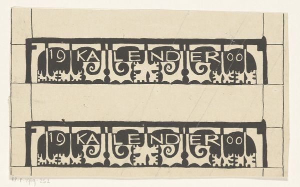
drawing, graphic-art, typography, ink
#
drawing
#
graphic-art
#
art-nouveau
#
typography
#
ink
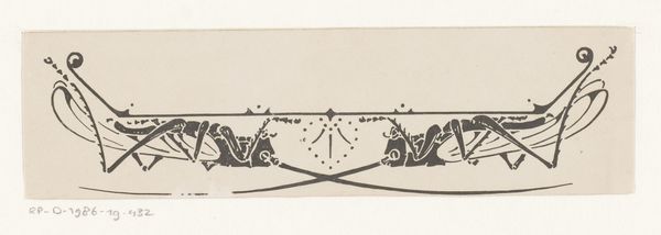
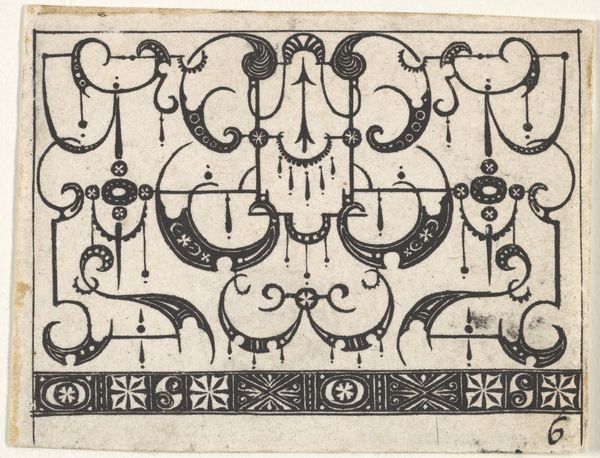
Dimensions: height 90 mm, width 205 mm
Copyright: Rijks Museum: Open Domain
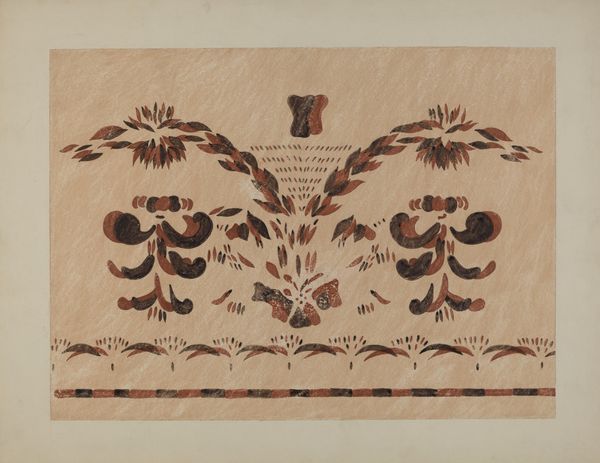
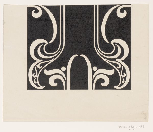
This is Reinier Willem Petrus de Vries’ ‘Ontwerp voor een titelhoofd’ or ‘Design for a Title Page’ created with pen and ink. The precision of the line work gives it a graphic quality, but the ink bleeds, hinting at the artists hand. I love the contrast between the flat planes of black ink and the small details in the curling tendrils; it makes me think about how even in the most controlled design, process and chance still find a way in. Look at the way the forms echo each other, the mirrored shapes above and below, the delicate curves creating a sense of flow. It’s like the artist is composing a visual symphony, each element carefully considered, yet somehow still alive with a sense of spontaneity. You can imagine this piece printed up large, as a poster, a sign, or as the cover to a magazine, maybe something like The Studio, published in London at the time. It reminds me of Aubrey Beardsley, but where Beardsley is decadent, Vries feels more restrained, more Dutch, maybe. Anyway, it’s a reminder that art is always a conversation, artists borrowing and building on each other's ideas across time.
Comments
No comments
Be the first to comment and join the conversation on the ultimate creative platform.
More like this