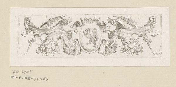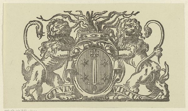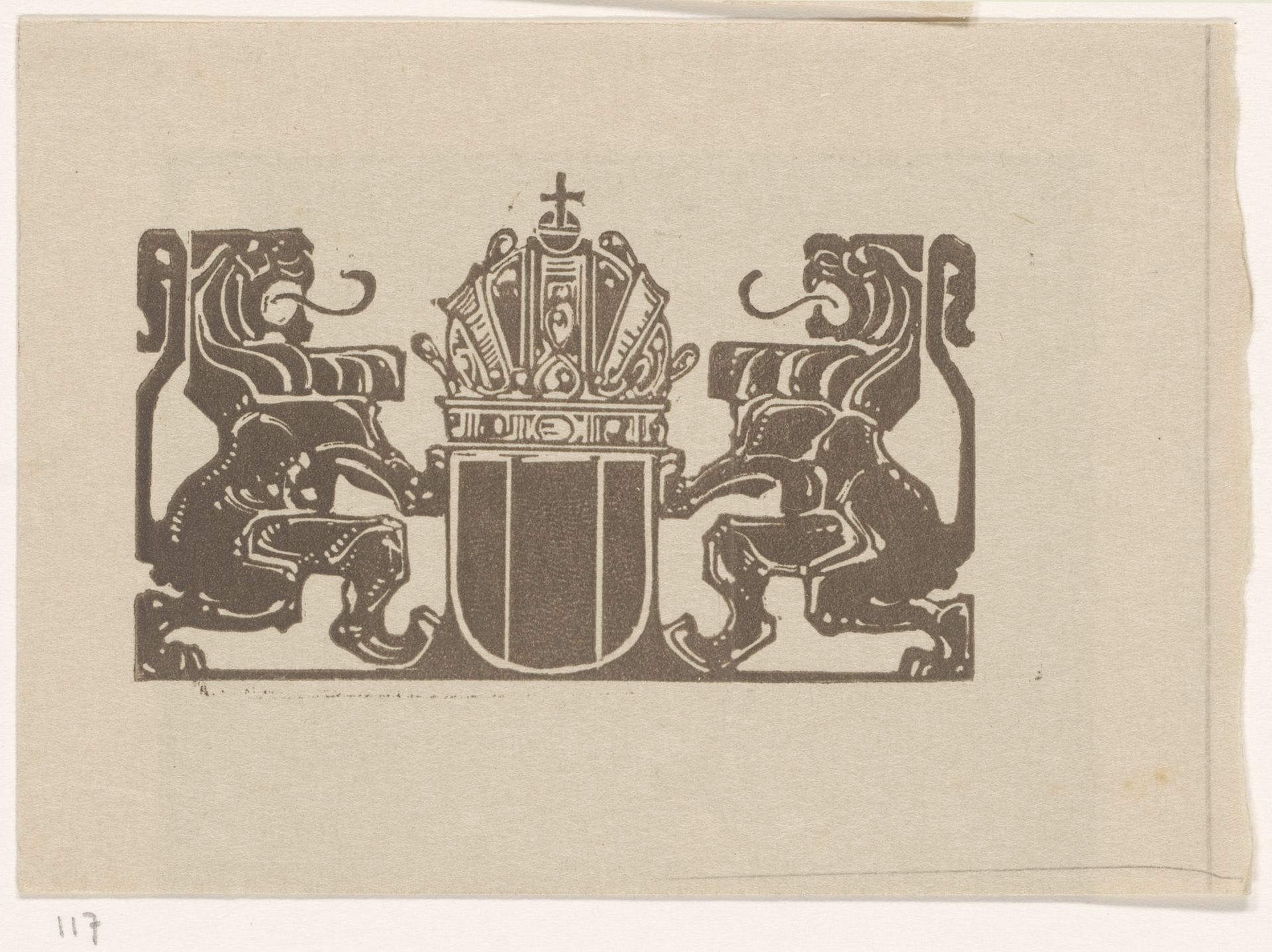
c. 1910
Wapenschild met twee leeuwen
Bernard Willem Wierink
1856 - 1939Location
RijksmuseumListen to curator's interpretation
Curatorial notes
Editor: Here we have Bernard Willem Wierink's "Wapenschild met twee leeuwen" from around 1910, a drawing or print made with ink. It’s pretty striking how geometric everything is, a real stylized take on heraldry. What can you tell us about this piece? Curator: I’m immediately drawn to the way this piece merges the high symbolism of heraldry with what I suspect is a relatively accessible printmaking technique. The question that arises is what impact the choice of materials and method of production had on the availability and use of heraldic imagery in the early 20th century. Editor: So, it's not just about the lions and the shield, but also *how* it was made and *who* could access it? Curator: Exactly. The materiality directs us to understanding how symbolic forms become democratized or commodified. Was this a unique commission, or one of many prints circulated to express or reinforce a specific social identity? Also, examine the paper itself. Its rough, almost industrial feel, departs from the vellum often associated with formal heraldry. Editor: Interesting. It makes you wonder about the social context it lived in... what meanings or associations the intended audience might have found there. It challenges the idea of art existing solely for aesthetic or symbolic purposes. Curator: Precisely. It compels us to consider the relationships between art, labour, and class at the beginning of the 20th century, rather than just analyzing iconography and royal genealogy. Editor: I hadn’t really thought about how the materials speak to a specific place and time. Thank you for drawing attention to the economic implications within it. Curator: And I now have new questions to explore about similar works produced around that time.