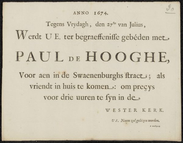
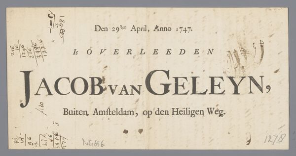
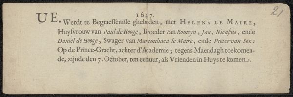
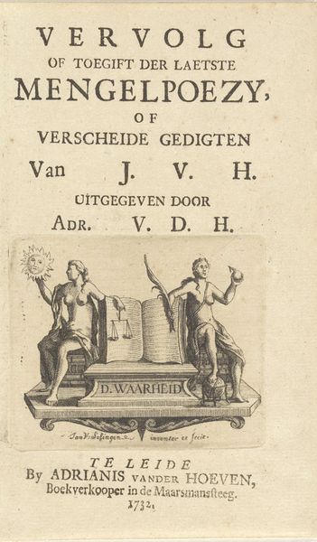
Uitnodiging voor Johannes Backhuysen voor de de begrafenis van Johanens de Hooghe (1650-1731) before 1732
0:00
0:00
ervenjacoblescailjeendirkrank
Rijksmuseum
print, typography
#
script typeface
#
sand serif
#
script typography
#
baroque
# print
#
hand drawn type
#
typography
#
hand-drawn typeface
#
stylized text
#
thick font
#
handwritten font
#
golden font
#
historical font
#
calligraphy
Copyright: Rijks Museum: Open Domain
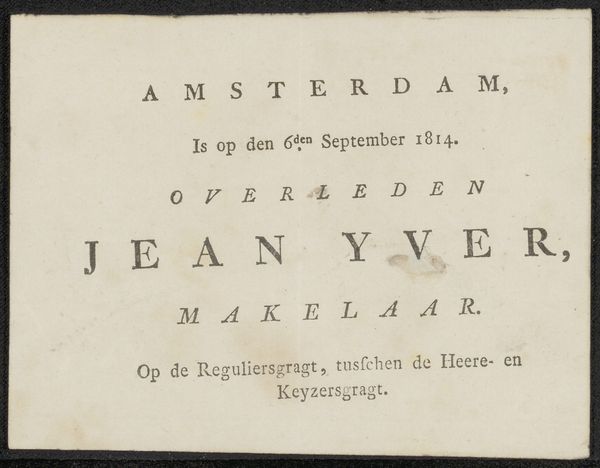
Curator: This small print, made before 1732, functions as an invitation. It’s addressed to Johannes Backhuysen, inviting him to the funeral of Jan de Hooge. The piece comes to us from the inheritance of Jacob Lescailje and Dirk Rank and resides here at the Rijksmuseum. Editor: Immediately, I'm struck by the starkness, a simplicity that belies its purpose. It feels direct, efficient even—almost as if the sorrow is distilled into these careful letterforms. Curator: The layout definitely speaks to that efficiency. It is Baroque in its arrangement but the type itself lends formality and some severity. A limited use of embellishment, keeps the focus squarely on the announcement. It has the visual solemnity you might expect from a piece concerned with mortality. Editor: And think of the printing process back then, right? Each letter carefully chosen and placed, the pressure of the press. It wasn’t some quick digital process—this involved labor, a specific skillset. I’m drawn to how such formal constraints—the material limitations— shape the tone of the whole thing. Was this printed on commission, I wonder? Curator: Most likely! Funeral invitations were common amongst the wealthy and the merchant classes in the 18th century. These prints became keepsakes and provided details about those in mourning. They follow particular formats. Editor: Right, it’s about who is invited. But I want to know about those left to mourn. Lescailje and Rank inherited this item but was that it’s intended destination? I'm wondering about the value we assign to these objects—are we admiring the composition or the lives that brushed against this card centuries ago? And who was Jan de Hooge to warrant such an invitation? What does Backhuysen's presence signify in the social fabric of Amsterdam at that time? It prompts so many questions. Curator: And sometimes the most interesting art poses more questions than answers, doesn’t it? I find myself moved by this invitation and contemplating the brief and poignant nature of existence. A beautiful and reflective image. Editor: Agreed, It speaks volumes. An incredibly rich little document.
Comments
No comments
Be the first to comment and join the conversation on the ultimate creative platform.
More like this