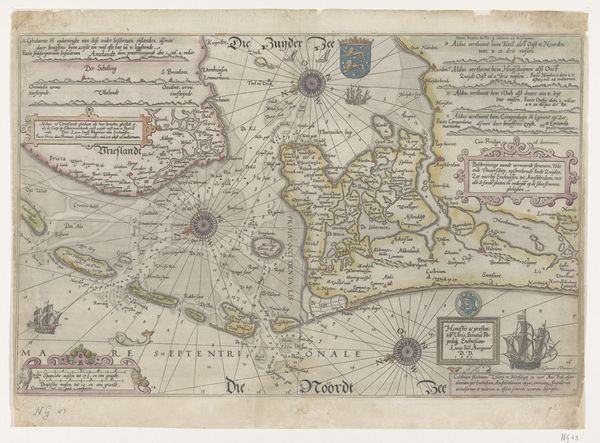
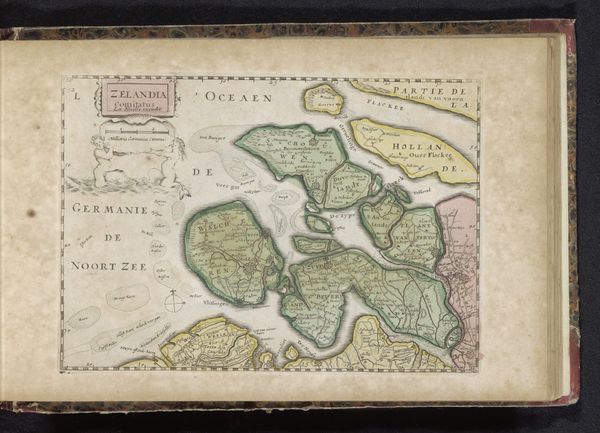
drawing, print, paper, ink, engraving
#
drawing
# print
#
paper
#
ink
#
coloured pencil
#
geometric
#
history-painting
#
engraving
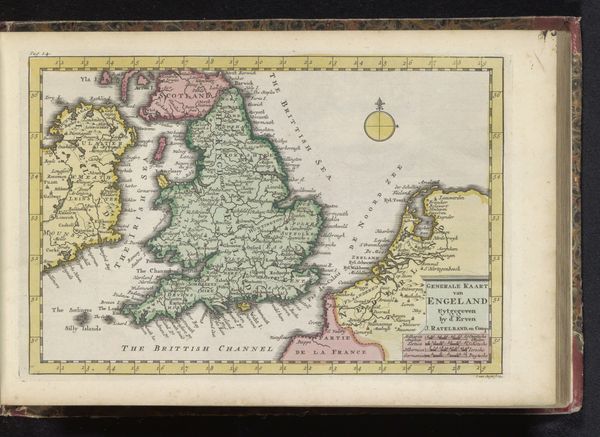
Dimensions: height 181 mm, width 265 mm
Copyright: Rijks Museum: Open Domain
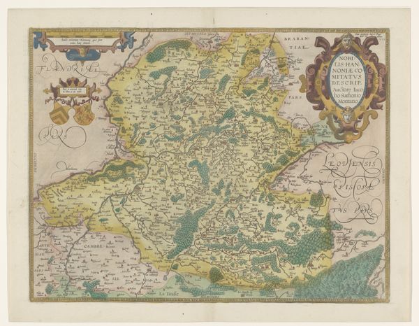
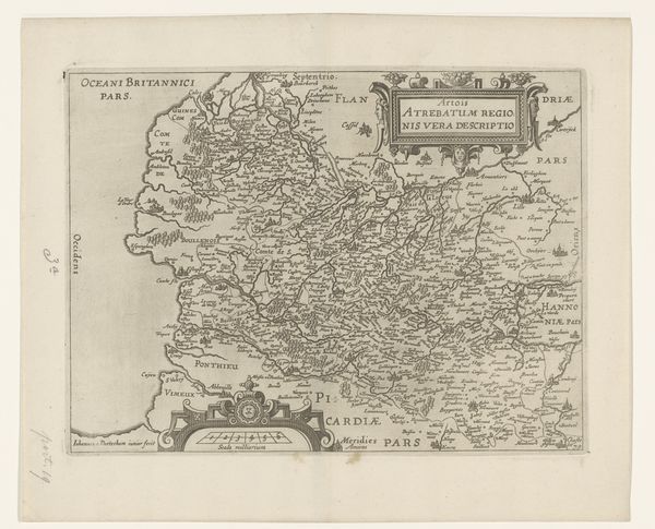
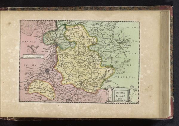
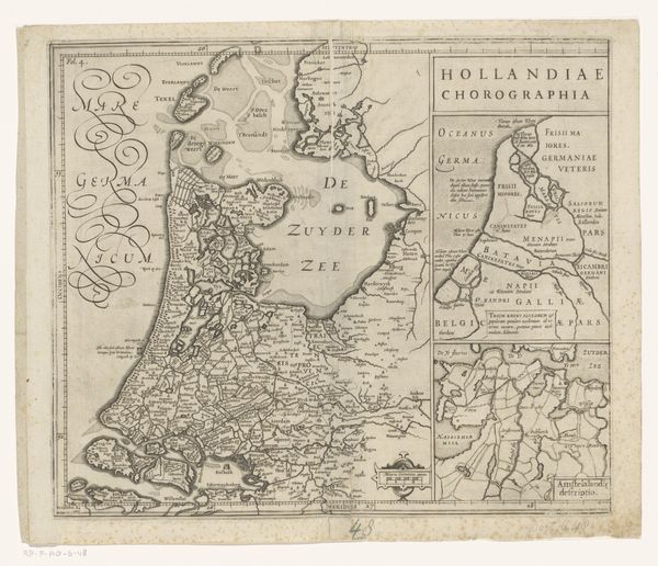
Editor: Here we have "Kaart van Schotland," a map of Scotland made sometime between 1700 and 1735. It’s a drawing and print on paper using ink and engraving. It feels… overtly political, even though it looks like a straightforward geographic representation. What can you tell me about this work? Curator: It's interesting that you read it as overtly political, because that’s precisely what a map like this aims to be – an assertion of power and control masked as objective information. Consider who was commissioning and consuming maps like this in the early 18th century. What were their interests in depicting Scotland in this way? Editor: So, not just about knowing where things *are*? Curator: Exactly. Maps aren’t neutral. They are inherently subjective. Think about the Act of Union in 1707 that formally unified Scotland and England. A map produced in that era wouldn't merely chart physical geography; it would inevitably reflect the shifting power dynamics and political aspirations of the time. Editor: Ah, so the inclusion of certain cities over others, or the prominence given to specific geographic features, would reflect specific agendas? Even the colours used? Curator: Precisely. How might different regions or territories be subtly emphasized or downplayed through colour or cartographic detail? And consider the heraldry, the cityscapes shown around the edges. Whose stories are they telling, and whose are they omitting? The map isn’t just about Scotland; it's about a *particular vision* of Scotland, one sanctioned, perhaps, by those in power. We might even examine its artistic style. Does its aesthetic align more with scientific accuracy or symbolic representation? Editor: That’s a totally different way of looking at a map. So, analyzing this map is like understanding whose perspective is being presented. Curator: Indeed. And acknowledging the mapmaker’s perspective, we are better able to consider and explore voices that may have been deliberately suppressed or were excluded entirely from this depiction of Scotland. Editor: I'll never look at a map the same way again. Thanks for untangling the historical narratives woven into this image!
Comments
No comments
Be the first to comment and join the conversation on the ultimate creative platform.
More like this