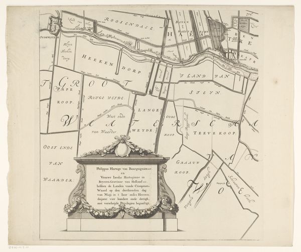
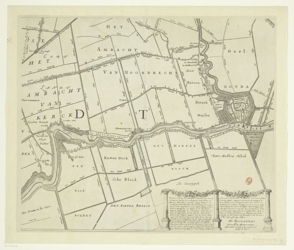
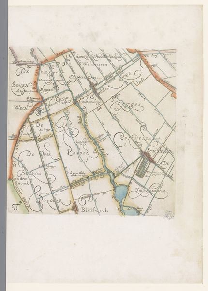
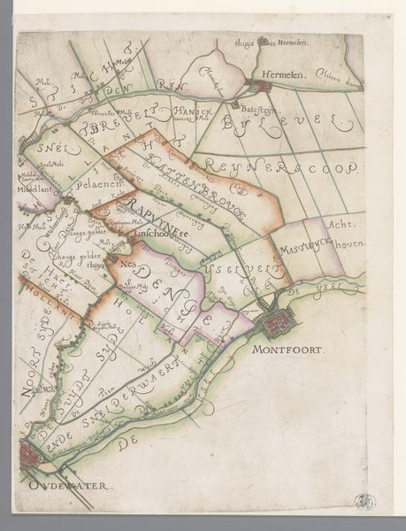
Kaart van het Hoogheemraadschap van de Krimpenerwaard (zesde deel van kaart) 1683
0:00
0:00
johannesleupenius
Rijksmuseum
graphic-art, print, paper, engraving
#
graphic-art
#
dutch-golden-age
# print
#
old engraving style
#
landscape
#
paper
#
line
#
cityscape
#
engraving
Dimensions: height 530 mm, width 534 mm
Copyright: Rijks Museum: Open Domain
Editor: Here we have a section of "Kaart van het Hoogheemraadschap van de Krimpenerwaard," a map by Johannes Leupenius, dating back to 1683. It's an engraving on paper, and I'm immediately struck by the almost geometric organization of the land. It's beautiful in its precision. What do you see in this piece? Curator: Indeed. The immediate appeal resides in the rigorous application of line. Observe how line becomes the primary structuring device, delineating not just geographical boundaries, but also creating a sophisticated network of negative space. These spatial intervals, these voids, contribute just as meaningfully to the overall composition as the lines themselves. Editor: So, you're less interested in what the map *represents*, and more in *how* it's represented? Curator: Precisely. Disregard the map’s purported function, and its compositional strength comes into sharper focus. Note the varied thicknesses and densities of the engraved lines, creating subtle modulations in tone and texture. What do you make of the relationship between the inscription in the lower register and the mapped area? Editor: The elaborate frame around the text clashes with the clean lines above, almost as if it belongs to another work altogether! It is a different style! Curator: A fruitful observation! The stylistic discord activates the surface and creates visual interest, preventing a descent into monotony. The cartouche, thus, ironically functions more as a disruptive aesthetic element than an informative one. Editor: I never considered that before – the "disruptive" element is a valid point. This map’s artistic quality is apparent when appreciating it through lines and composition.
Comments
No comments
Be the first to comment and join the conversation on the ultimate creative platform.
More like this