Dimensions: height 221 mm, width 149 mm
Copyright: Rijks Museum: Open Domain
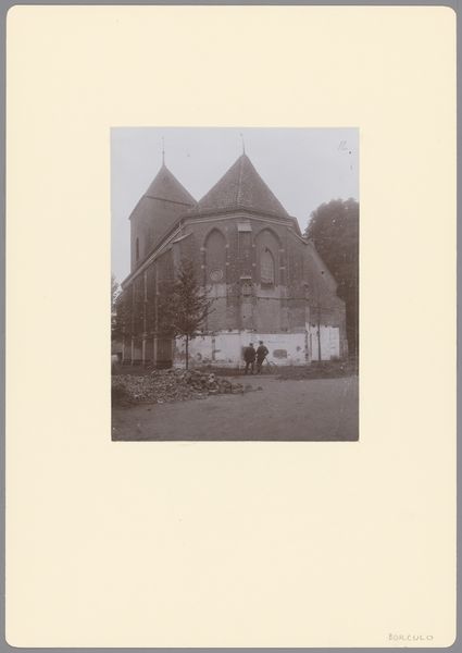
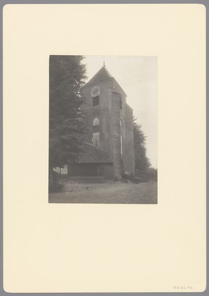
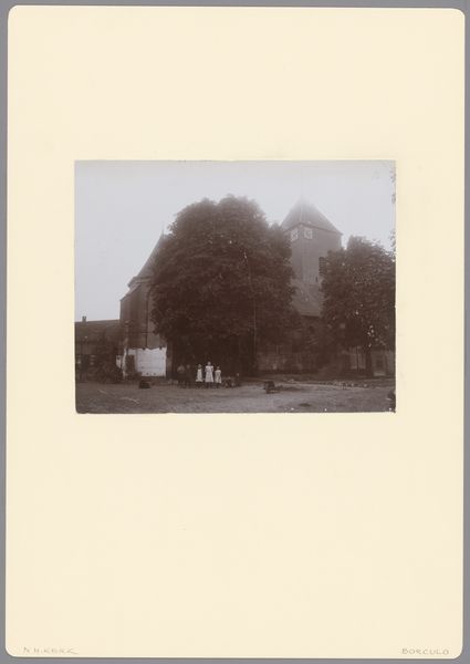
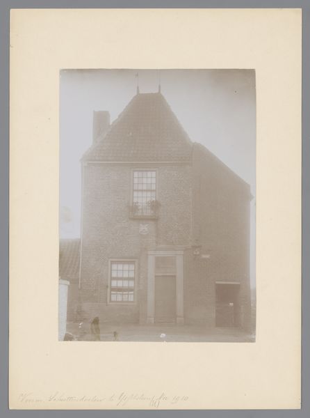
Editor: This photograph, "Toren van de Joriskerk te Borculo," from 1911, shows the tower of St. George's Church in Borculo. The stark monochrome gives it a somber, almost imposing feel. I’m struck by how the geometric tower dominates the composition against the softer lines of the surrounding buildings. What elements stand out to you most? Curator: Indeed. I am immediately drawn to the relationship between the architectural forms and the monochromatic palette. Observe how the verticality of the tower contrasts with the horizontal lines of the adjacent structure. This juxtaposition creates a dynamic tension within the frame. Consider also the light and shadow play – how the artist utilizes this to delineate the various planes of the tower, enhancing its three-dimensionality. Editor: I see what you mean. The stark contrast gives the image more depth. So you focus mainly on the shape, form, light? Curator: Precisely. We can analyze the image through its formal components – line, shape, color, texture, and composition – and their interrelationships. The arrangement of elements within the frame constructs its meaning and generates its aesthetic impact. How do you feel this arrangement influences your reading of the image? Editor: I see how those features add to the image's solemn effect, that I immediately noticed, but from a technical perspective. Now, focusing on visual construction adds another layer of understanding. Curator: Absolutely. Through careful examination of form, we arrive at a deeper appreciation of the artwork's visual syntax and its unique power. Editor: Thank you, looking at the work’s inherent components allows us to deconstruct its complexity more methodically.
Comments
No comments
Be the first to comment and join the conversation on the ultimate creative platform.
More like this