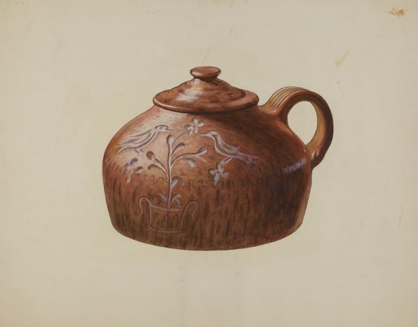
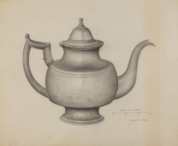
drawing, watercolor
#
drawing
#
oil painting
#
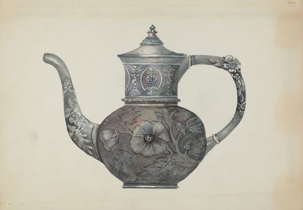
watercolor
#
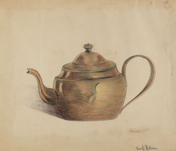
coloured pencil
#
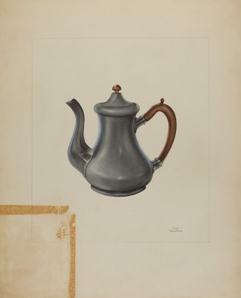
watercolor
#
realism
Dimensions: overall: 26.5 x 35.7 cm (10 7/16 x 14 1/16 in.)
Copyright: National Gallery of Art: CC0 1.0
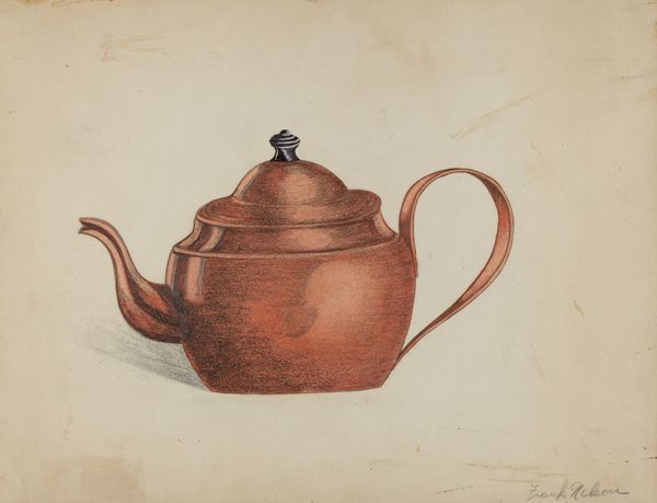
Curator: Good morning! I’m excited to discuss Beulah Bradleigh's "Pewter Teapot," circa 1936. It appears to be a drawing, likely using watercolor and colored pencils. What's your initial reaction? Editor: It’s… quiet. Domestic. I'm immediately struck by how gentle the rendering is; those soft edges and muted tones create an almost dreamlike quality. It evokes a very specific kind of understated, mid-century elegance, doesn't it? Curator: It absolutely does. Bradleigh created this during a period of immense social and economic change. The Great Depression influenced a lot of artistic creation at this time, focusing on the everyday. A teapot, in its ordinariness, reflects that ethos perfectly. It’s accessible. It speaks of simpler pleasures. Editor: The simplicity, yes. Yet the attention to detail prevents it from being *too* simple, I think. Look at the subtle marbling effect on the body of the pot, or the gentle highlights on the metal. It speaks to the care and ritual of tea-making, a small moment of calm in what might have been a rather tumultuous world. Do you see it as commentary, though? Curator: Commentary might be a bit strong, but I certainly see it as a kind of… recording. Not of grand events, but of personal space, private moments. Museums have often framed domestic art of this time, like Bradleigh's teapot, in relation to broader changes in societal roles and the economy. It’s a document, but also a study. Editor: A study in quietude. I think the muted colors enhance that feeling, lending the piece a nostalgic haze, as if the image itself were gently steeped in history. There’s a tangible sense of history here; one can almost feel the warmth emanating from the spout. What do you make of the lack of a background? Curator: The negative space directs us to a place of focus. What could be interpreted as negative space in artistic study opens conversations centered around form, texture, shape and tone when the background is removed. We can see what Beulah found to be visually compelling about the teapot form in her domestic world during this era. What better object than one used to facilitate connection through dialogue and warm shared beverage. It all holds such beautiful symmetry. Editor: Symmetry, certainly. Well, it's certainly given me pause. An unexpected glimpse into the beauty of ordinary moments. Curator: Absolutely. It reminds us to look closely at the objects we surround ourselves with; they often hold more stories than we realize.
Comments
No comments
Be the first to comment and join the conversation on the ultimate creative platform.
More like this