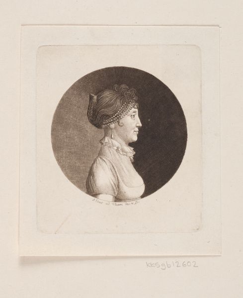
aquatint, print, engraving
#
portrait
#
aquatint
#
neoclacissism
# print
#
engraving
#
realism
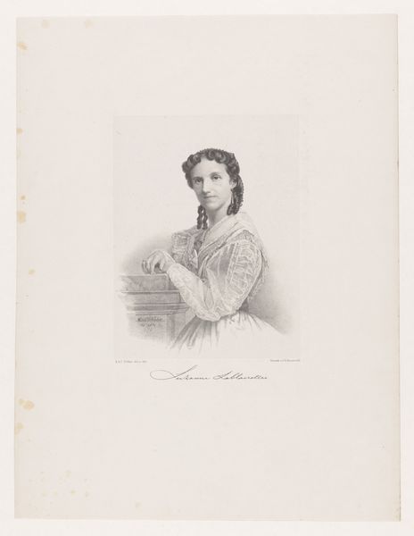
Dimensions: 247 mm (height) x 179 mm (width) (bladmaal), 150 mm (height) x 95 mm (width) (plademaal), 100 mm (height) x 75 mm (width) (billedmaal)
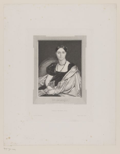
Editor: Here we have "Thomasine Gyllembourg-Ehrensvärd," made sometime between 1748 and 1831 by J.F. Clemens. It's a print created using aquatint and engraving. The woman has a calm and self-possessed air about her, quite striking actually. What do you make of it? Curator: Immediately, the formal composition commands attention. Consider the triangular structure formed by her pose: the arm resting on the book supports her head, leading the eye upwards, creating a closed form within the pictorial space. This reinforces the self-contained and contemplative mood you observed. What visual elements draw your eye? Editor: The contrast, certainly! The areas around the face are very clearly delineated and become more indistinct the further down we go. Curator: Indeed. Observe how the aquatint technique softens the gradations of light and shadow, particularly on the shawl. This tonal subtlety lends a certain sfumato effect, softening contours and enhancing the overall sense of depth. But notice too, how this emphasis throws focus to her facial features, a key element within portraiture. Editor: So, the choice of technique directly influences where the eye is drawn and how we interpret the subject's mood? Curator: Precisely. The lines create shapes, the forms are light and shadow, but overall these combine to communicate and enhance its formal integrity. Now, is this what first interested you? Editor: I suppose I hadn't thought of it that way before! I saw the softness and only then felt the mood of the work. Thank you! Curator: A fruitful exercise! These tools of line and tonality combined together build towards meaning, rather than from a single element alone.
Comments
No comments
Be the first to comment and join the conversation on the ultimate creative platform.
More like this