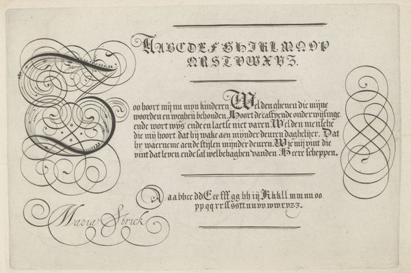
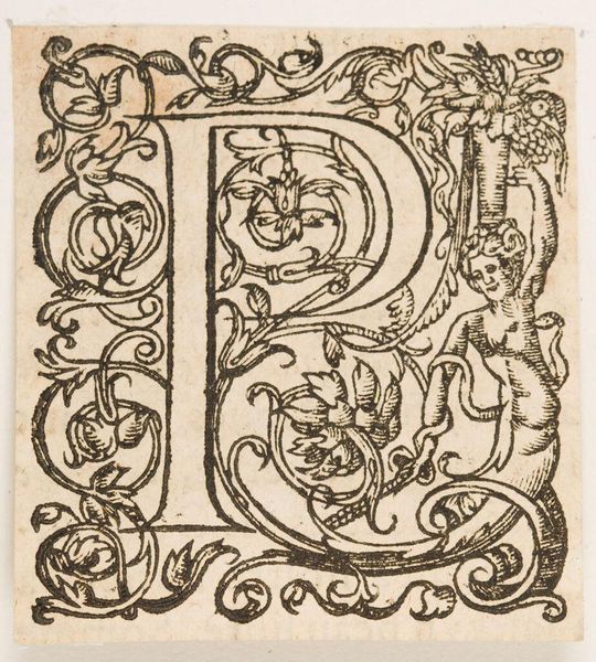
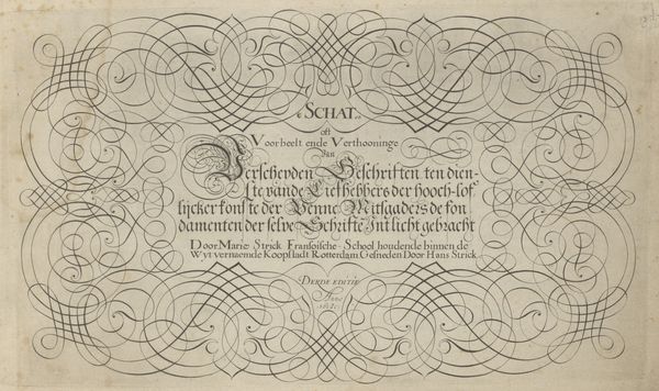
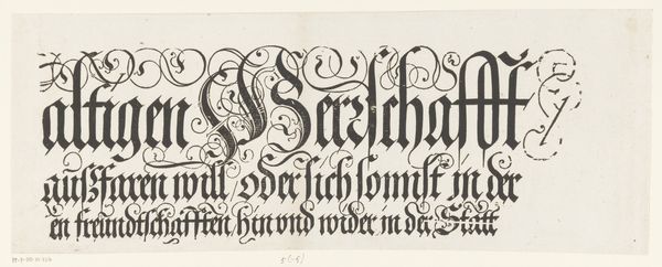
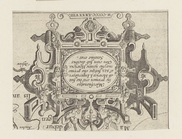
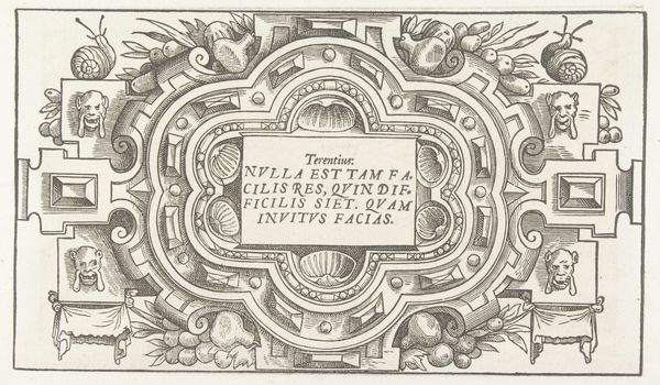
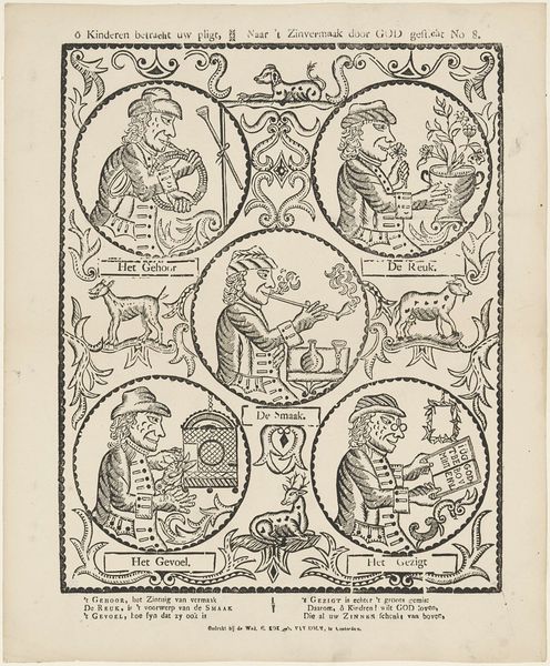
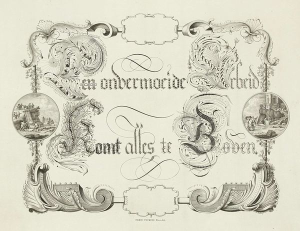
graphic-art, print, typography
#
word art style
#
pattern out of typography
#
graphic-art
#
art-nouveau
# print
#
text art
#
hand drawn type
#
hand lettering
#
word art
#
typography
#
hand-drawn typeface
#
organic pattern
#
funky pattern
#
coloring book page
Dimensions: height 96 mm, width 225 mm
Copyright: Rijks Museum: Open Domain
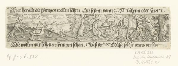
Curator: My eye is immediately drawn to the delightful frieze of animals parading across the top and bottom of the artwork. What are your first impressions of it? Editor: I find its quaintness almost defiant. We're looking at a letterhead design titled "Briefhoofd van Le Nobel & Labots," dating from between 1874 and 1932, seemingly printed. It has a somewhat muted palette, making me wonder about the social function of artistic design during that period and how aesthetics intersect with commercial identity. Curator: A keen observation. It's by Mathieu Lauweriks, an artist known for his engagement with symbolic geometry and theosophy. I am intrigued by the selection of these animals. Look, some stand upright, holding what appears to be crosses, while others parade. They could represent attributes, guardianship or maybe alchemical processes. It blends a practical need – business correspondence – with something almost mythical. Editor: Exactly, and I think situating this commercially within the Art Nouveau movement, there’s this distinct return to organic form, while also seeking a unified artistic vision across various domains of life. How did this symbol of "hand lettering" function as a visual marker? What impact did it have on both the brand and on wider aesthetics? Curator: Lauweriks certainly understood the power of embedding symbols in the everyday. The symmetrical arrangements, combined with the almost illuminated text, creates a subtle emotional appeal. This print has organic patterns running around the name which draws your eye to it. Editor: Indeed. Considering typography itself as art makes a bold statement. This piece transcends its immediate commercial purpose by also becoming a reflection of early twentieth century cultural values. What else does it trigger? Curator: It makes me think about how visual elements, even on something as ordinary as business letterheads, communicate deep rooted cultural narratives. Today, our correspondence might not often have images such as this adorning it, however images hold heavy connotations in other ways for many people across digital mediums and it begs us to consider what underlying visual and social structures these mediums produce and maintain. Editor: An interesting end point. It forces us to question how art interacts with commerce and visual culture to reflect and shape society. It becomes a tool that helps understand culture, social, political norms, the values assigned.
Comments
No comments
Be the first to comment and join the conversation on the ultimate creative platform.
More like this