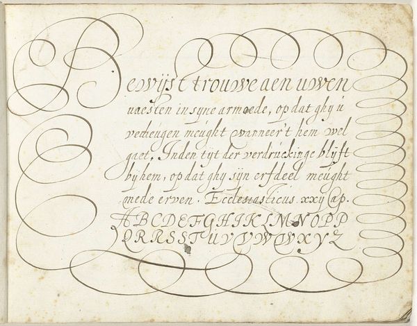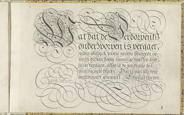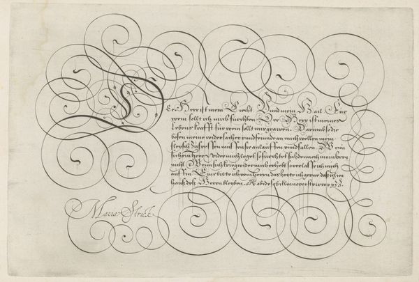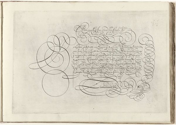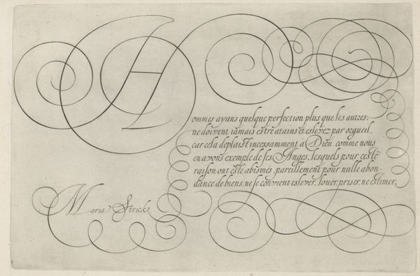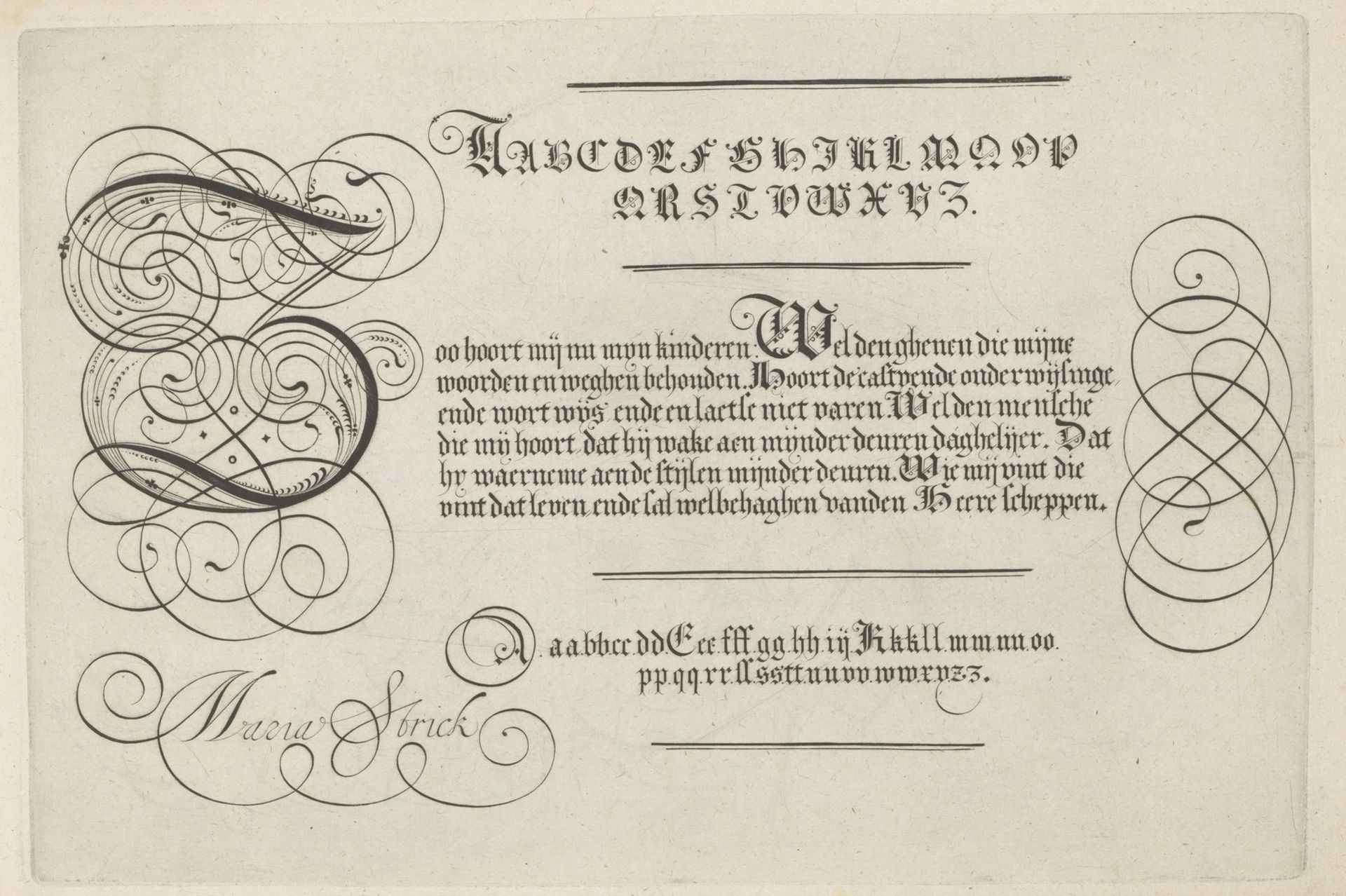
1618
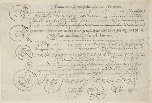
Schrijfvoorbeeld met kapitaal Z
Hans Strick
1566Location
RijksmuseumListen to curator's interpretation
Curatorial notes
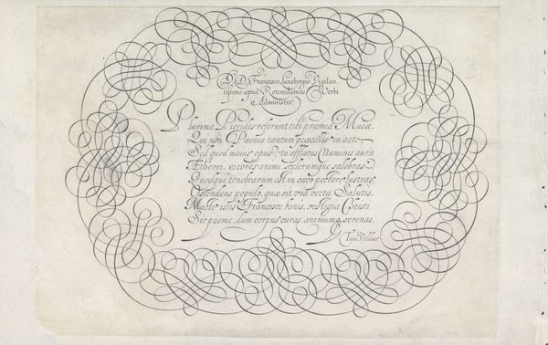
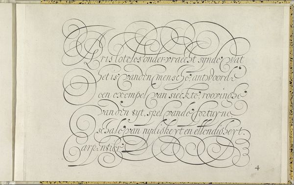
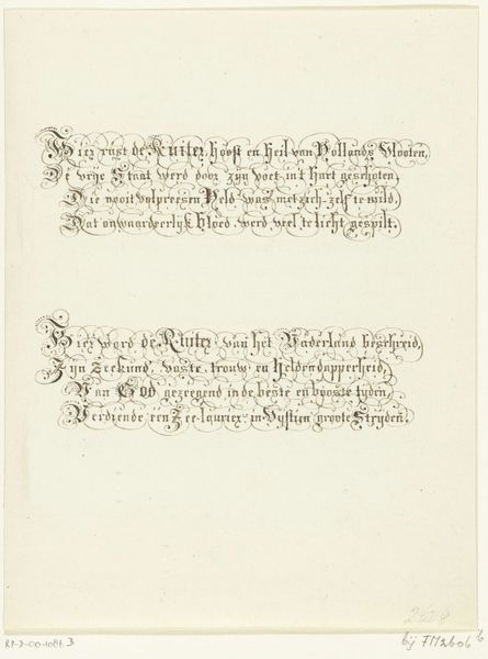
Editor: This is "Schrijfvoorbeeld met kapitaal Z" from 1618, by Hans Strick, using ink on paper. It features ornate calligraphy—mostly lettering—but the monumental ‘Z’ practically dances off the page! What can we make of such prominent calligraphy? Curator: Ah, yes, dance is an excellent descriptor. Think about it: each letter, each flourish, is a gesture, carrying with it not just information, but a whole history of meaning and intent. Look closely at the large “Z.” Does it remind you of anything? Perhaps the embrace of figures in classical sculpture? Or the elaborate twists in baroque ironwork? Editor: I see what you mean! It's almost like a human form intertwined within the letter. But what does that *mean* in this context? Curator: Well, in the 17th century, calligraphy was far more than just handwriting. It was a respected art form, a demonstration of skill, education, and even social standing. This elaborate "Z," isn’t merely a letter. It’s a symbol of knowledge, of connection to a lineage of learning. It embodies both tradition and innovation. The twisting lines, the precise spacing, were visual cues for a learned audience. Editor: So it’s about belonging to a cultural conversation, a shared visual language? Curator: Precisely. And that language carries cultural memory. The shapes, the forms… they resonate with deeper symbolic meanings. Each carefully placed stroke reinforces a connection to classical ideals, to a shared understanding of beauty, order, and knowledge itself. Editor: That’s fascinating. I had initially seen only beautiful writing, but it is so much more than what it literally says. Curator: Indeed. By understanding the cultural symbols embedded within the visual form, we discover the lasting power of the image.