drawing, print
#
drawing
# print
#
line
#
genre-painting
#
watercolor
Dimensions: height 205 mm, width 294 mm
Copyright: Rijks Museum: Open Domain
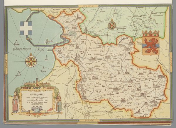
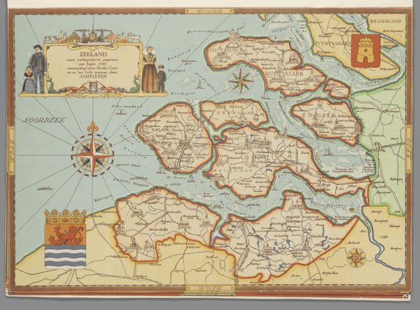
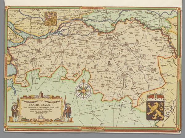
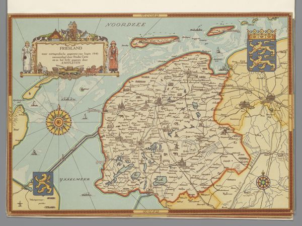
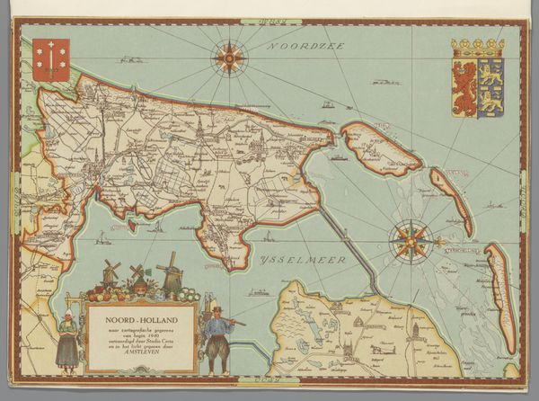
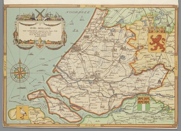
Studio Certo made this map of Groningen in 1940 using what looks like coloured inks and precise linework. The colours are restrained, like old parchment, which gives it a feeling of something historical, even though it was made relatively recently. I really get into the way the areas are defined with these fine, continuous lines. The process of mapping, like painting, is about creating boundaries and relationships, making decisions about what to include and what to leave out. Look closely at the compass rose floating in the sea – it’s not just a functional element, it's a mini work of art in itself, with delicate shading and detail. It’s like the artist is saying, "Here is the heart of this map". It reminds me of some of Alfred Jensen’s grid paintings, but with a practical purpose. Both artists are organizing information into fields, imposing a kind of order, and inviting us to explore the underlying structures. Ultimately, maps, like art, are about how we see and understand our place in the world.
Comments
No comments
Be the first to comment and join the conversation on the ultimate creative platform.
More like this