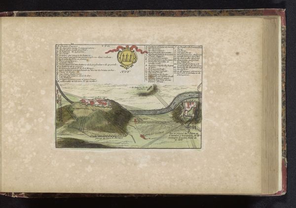
drawing, print, paper, ink
#
drawing
#
baroque
# print
#
paper
#
ink
#
coloured pencil
#
cityscape
Dimensions: height 119 mm, width 172 mm
Copyright: Rijks Museum: Open Domain
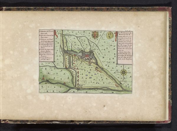
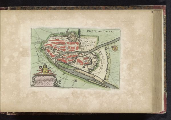
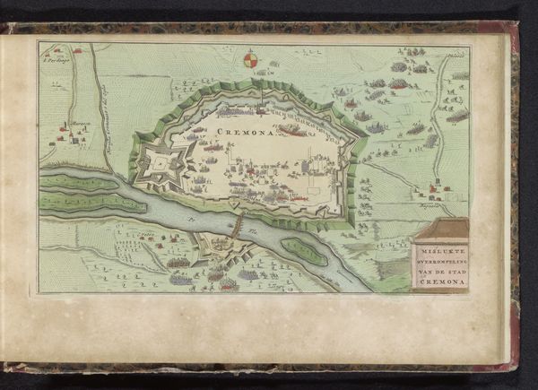
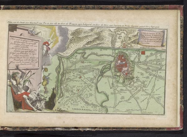
Editor: This is a rather detailed "Plattegrond van Antwerpen," or map of Antwerp, created between 1700 and 1735. It appears to be a print with ink on paper. It is hard to imagine the actual scale of Antwerp from this rendering. What catches your eye about its composition and use of form? Curator: What strikes me first is the clear delineation of space, achieved through line and colour. Notice the sharp contrast between the red indicating urban development and the green signifying natural or less built-up areas. Editor: I do see that sharp contrast. It almost flattens the image, prioritizing clarity over realism. Curator: Precisely. The artist seems less concerned with rendering a photographic likeness of Antwerp. Consider how the river, rendered in blue, curves through the composition, acting almost as a structural backbone. Note too, how it functionally divides, but aesthetically provides a crucial visual axis and contrast, thus contributing to a balanced composition, would you agree? Editor: I hadn't thought of it that way, but I can see how it really frames the entire layout! Curator: Also, the linear fortifications surrounding the city proper highlight strategic planning. It would be easy to fixate solely on its utilitarian aspect. What could you conclude, purely on an aesthetic level, when considering their angular, geometric design and relationship to the organic curvature of the river? Editor: The interplay between the rigid, almost aggressive, geometry of the fortifications and the natural curve of the river adds a dynamism, even a tension to the visual experience. Curator: A tension resolved through careful visual arrangement. And did you notice how the colour palette accentuates this effect? There seems to be so much more at play than topography alone! Editor: I will never look at a map the same way again. Focusing on the artistic elements reveals a whole new perspective. Curator: Exactly. A formalist reading underscores that visual elements aren’t merely representational, but actively shape meaning.
Comments
No comments
Be the first to comment and join the conversation on the ultimate creative platform.
More like this