Copyright: Victor Pasmore,Fair Use
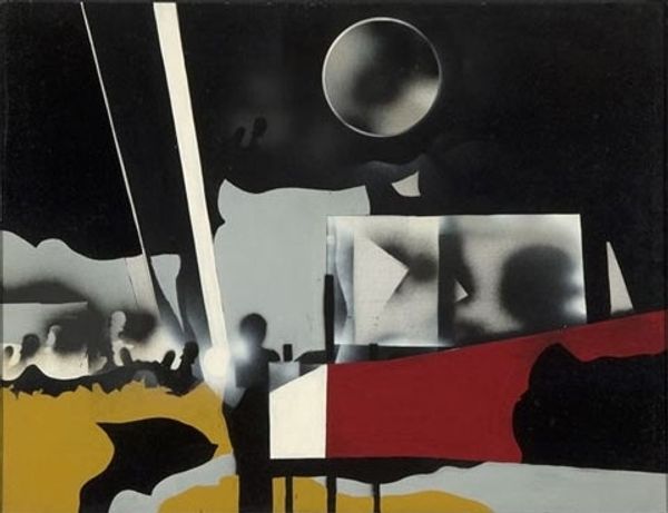
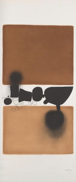
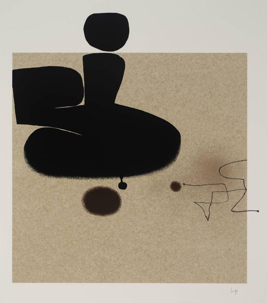
Victor Pasmore made this painting with ink, playing with a simple palette of black and white to create an image of shifting depths and forms. It feels like Pasmore is thinking through the process of painting, using these graphic shapes to explore the relationship between the geometry and fluidity. The matte surface of the paper grounds the work, giving the blurry shapes a solid home. The contrast between the sharp edges of the shapes and the softer, sprayed areas around them is really striking. It's in these hazy parts, like the one near the top left, that you can feel Pasmore's hand and process most directly. The varying textures give the piece a tactile quality, inviting you to reach out and trace the shapes with your fingers. It reminds me of a deconstructed landscape, not unlike some of what you see in the paintings of Arthur Dove, whose work shares Pasmore’s focus on abstracting natural forms. Ultimately, the painting remains wonderfully ambiguous, embracing the idea that art can exist in the space between clarity and mystery.
Comments
No comments
Be the first to comment and join the conversation on the ultimate creative platform.
More like this