Ontwerp voor een advertentie van Cursus Holthuizen 1884 - 1952
0:00
0:00
drawing, graphic-art, paper, typography, ink, poster
#
portrait
#
drawing
#
graphic-art
#
art-nouveau
#
paper
#
form
#
typography
#
ink
#
abstraction
#
line
#
poster
Dimensions: height 165 mm, width 189 mm
Copyright: Rijks Museum: Open Domain
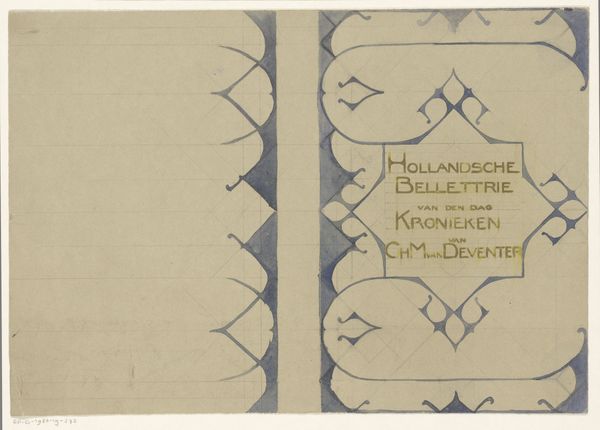
This is Reinier Willem Petrus de Vries's "Ontwerp voor een advertentie van Cursus Holthuizen" and it was made with pen and ink. You can see the artist's hand in every line. It feels like a direct translation of thought onto paper. I love how the artist doesn't try to hide the process. The sketch lines are still visible beneath the bolder strokes of ink that define the man, the lettering and the frame around the text. Look closely and you can see where the ink bleeds slightly into the paper, especially around the bold letters of ‘HOLTHUIZEN’. It reminds me of a woodcut, but it's all done by hand, with a kind of earnestness. There’s a simplicity to the design, a sense of getting right to the point. In its directness, it reminds me of some of the early modernist graphic designers, like Lucian Bernhard, who stripped away ornamentation to focus on the essential message. It’s this kind of honesty and clarity that makes art, and design, so compelling. It invites us to engage, to think, and to see the world with fresh eyes.
Comments
No comments
Be the first to comment and join the conversation on the ultimate creative platform.
More like this