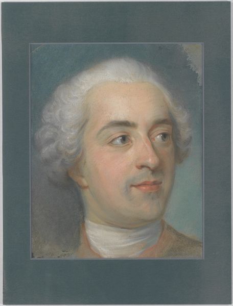
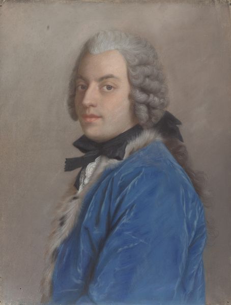
pastel
#
portrait
#
pastel
#
rococo
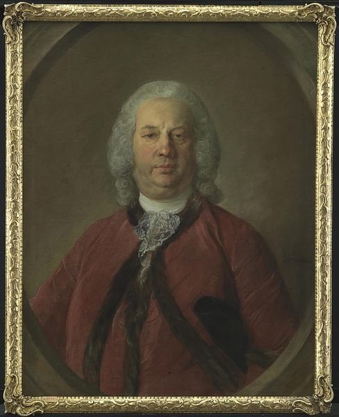
Dimensions: height 63 cm, width 51 cm
Copyright: Rijks Museum: Open Domain
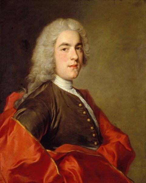
Curator: Here we have Jean-Étienne Liotard's pastel portrait of Cornelis Calkoen, dating from between 1738 and 1742. It resides here in the Rijksmuseum, a wonderful example of the Rococo style. Editor: My first impression is rosy cheeks and a buttoned-up kind of serenity! There's something soft, almost dreamlike, about the pastel medium here. It is as if he’s slightly embarrassed. Curator: The use of pastel is quite crucial, I think. It was the perfect medium to express the ideals of Rococo art, lending itself to delicate colours and soft, flattering textures. Beyond the stylistic choices, portraiture of this era, and of this person, spoke volumes. Calkoen belonged to Amsterdam's governing elite. These are not accidental markers, they project power and authority. Editor: Exactly. It is like he's carefully placed to represent an elite and specific image. Look at the powdered wig! The rich reddish jacket...but even though it's stately, it feels very…human. Not stiff, necessarily, there's an approachability there too. Or is that the pastel softening what could have been harsher? Curator: Definitely the pastel. It does not have the stark precision of oils. And in some respects, this more relaxed pose marked a shift. Look at the open jacket, suggesting leisure and wealth but not excessive display of luxury as something morally reprehensible. He appears, as you say, more relatable, someone involved in society but with individual taste. He's even a little...wistful? Editor: Wistful. Yes, perfectly captures it! It's those eyes, maybe. They're not commanding. You get a real sense of a person, beyond the wig and the buttons. Maybe that hint of embarrassment. Perhaps he hates getting his portrait painted, I do. Curator: Maybe. It’s intriguing how this artwork, initially commissioned to signify authority and status, opens a tiny window into a person that seems so grounded, which the use of pastels amplifies and softens even now. The emotional effect is what truly lasts. Editor: That tension between societal role and inner self is wonderfully communicated, for sure, with some soft strokes. It's why even now, centuries later, it quietly captivates us.
Comments
No comments
Be the first to comment and join the conversation on the ultimate creative platform.
More like this