Curatorial notes
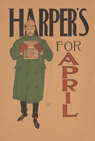
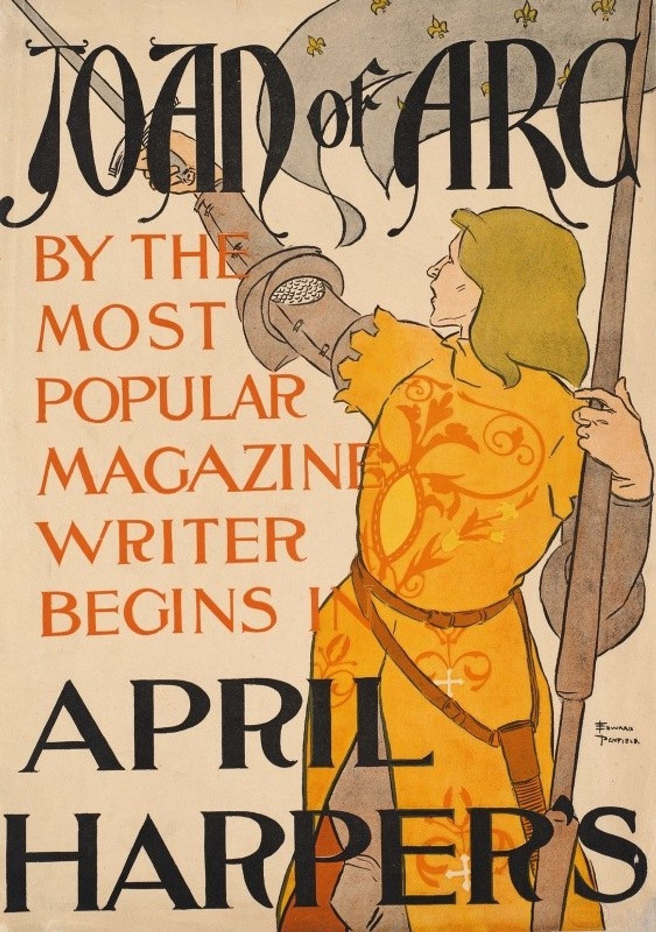
Here we see Edward Penfield's poster "Joan of Arc, April Harper's". The artist uses a restricted palette of black, tan, yellow, and gray, applied in flat planes to create an image with notable graphic impact. The composition is dominated by large sans-serif typography, framing the figure of Joan of Arc. Penfield strategically employs contrast, juxtaposing areas of bold text with the more subtly rendered figure. Joan's stylized form and dress are adorned with patterned details; these create visual interest without disrupting the poster's overall flatness. The strategic use of line and color serves a dual purpose, functioning aesthetically while reinforcing the poster's textual message. In essence, Penfield uses formal devices not merely for decoration, but as integral components of the message itself, turning the poster into a unified semantic and visual experience.