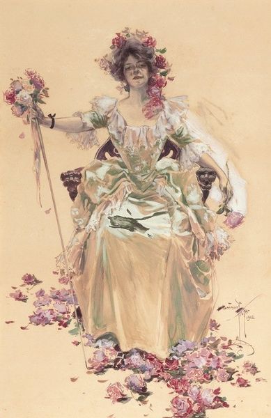
1907
The Saturday evening post, June 8, 1907
Listen to curator's interpretation
Curatorial notes
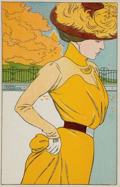
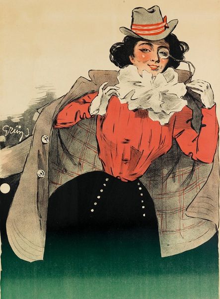
This cover of *The Saturday Evening Post*, June 8, 1907, was printed with lithography, and designed by Edward Penfield. You see the way he's blocked the figure out with flat planes of color, but left all the linework visible? It's kind of like the difference between a coloring book and a fully rendered painting. Your eye keeps moving around the image, trying to assemble the parts into a whole. This is what I call the productive tension of painting. The fun part! The figure is both abstract and real. Look at the way the folds of her dress are suggested with just a few lines. Each decision so clear and deliberate. And the color palette is restrained, almost tonal. It’s like he's saying, "Here are the basics. Now, *you* fill in the blanks." In the end, Penfield reminds me a lot of someone like Toulouse-Lautrec, both in terms of graphic economy and approach to marketing. It's all about hinting at a story, not telling it outright.