About this artwork
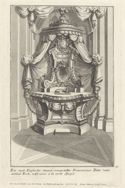
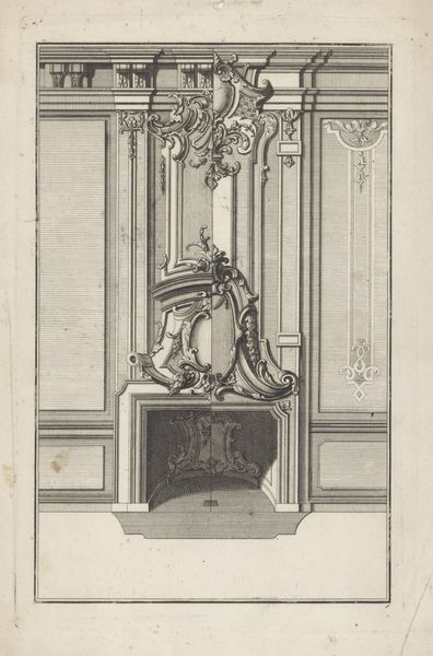
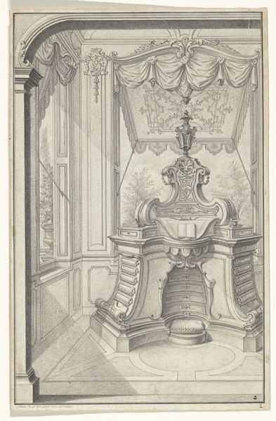
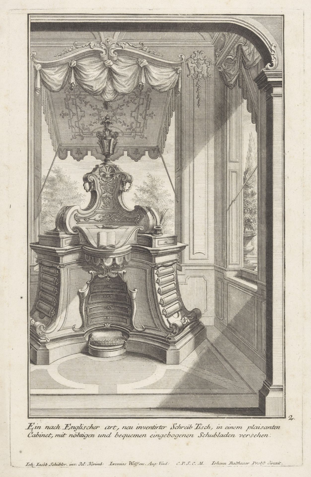
Editor: Here we have Johann Balthasar Probst's "Schrijftafel naast ramen," a print from the early 18th century. I'm struck by how ornate the writing desk is; it dominates the composition with its complex, almost theatrical structure. What strikes you most about this engraving? Curator: Indeed. A formalist approach leads us to observe that Probst's strategic use of line weight and density creates visual interest and conveys depth. The subject’s location near windows suggests that its very structure relies on ambient light in the overall visual and architectural scheme of things. The textures conveyed—the smooth surfaces versus the fabric folds—underscore material contrasts and suggest the skill of the artisan responsible for it's making. It invites consideration of semiotic play within Baroque conventions, would you agree? Editor: Definitely! It's interesting how the rigid lines of the desk contrast with the softer, almost draped appearance of the canopy above. But I wonder, is that enough to suggest its purpose? It's more than mere ornamentation. Curator: Precisely. Observe how the vertical lines, originating from the geometric base and culminating in the complex carvings overhead, suggest an upward movement, perhaps representative of Baroque's fondness for hierarchy. Consider that the artist uses framing in several places within the overall image; note in particular how each use leads our eyes to consider their role in the creation of both interior and exterior "realities." These elements help one move between simple aesthetics and something deeper, wouldn't you say? Editor: Yes, absolutely! I hadn't considered how the vertical lines contribute to this sense of Baroque grandeur, yet function in framing in the purest sense. Now I can better appreciate the artist's choices in line and form beyond mere representation. Curator: Then the artwork has communicated effectively through its intrinsic elements. That is the mark of its genius!
Artwork details
- Medium
- print, engraving
- Dimensions
- height 300 mm, width 192 mm
- Location
- Rijksmuseum
- Copyright
- Rijks Museum: Open Domain
Tags
Comments
Share your thoughts
About this artwork
Editor: Here we have Johann Balthasar Probst's "Schrijftafel naast ramen," a print from the early 18th century. I'm struck by how ornate the writing desk is; it dominates the composition with its complex, almost theatrical structure. What strikes you most about this engraving? Curator: Indeed. A formalist approach leads us to observe that Probst's strategic use of line weight and density creates visual interest and conveys depth. The subject’s location near windows suggests that its very structure relies on ambient light in the overall visual and architectural scheme of things. The textures conveyed—the smooth surfaces versus the fabric folds—underscore material contrasts and suggest the skill of the artisan responsible for it's making. It invites consideration of semiotic play within Baroque conventions, would you agree? Editor: Definitely! It's interesting how the rigid lines of the desk contrast with the softer, almost draped appearance of the canopy above. But I wonder, is that enough to suggest its purpose? It's more than mere ornamentation. Curator: Precisely. Observe how the vertical lines, originating from the geometric base and culminating in the complex carvings overhead, suggest an upward movement, perhaps representative of Baroque's fondness for hierarchy. Consider that the artist uses framing in several places within the overall image; note in particular how each use leads our eyes to consider their role in the creation of both interior and exterior "realities." These elements help one move between simple aesthetics and something deeper, wouldn't you say? Editor: Yes, absolutely! I hadn't considered how the vertical lines contribute to this sense of Baroque grandeur, yet function in framing in the purest sense. Now I can better appreciate the artist's choices in line and form beyond mere representation. Curator: Then the artwork has communicated effectively through its intrinsic elements. That is the mark of its genius!
Comments
Share your thoughts