#
abstract-expressionism
# print
#
geometric
#
abstraction
Copyright: National Gallery of Art: CC0 1.0
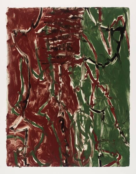
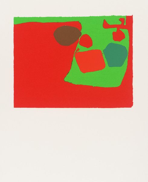
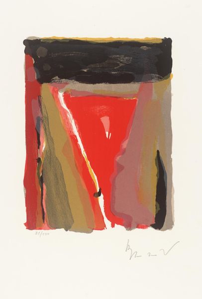
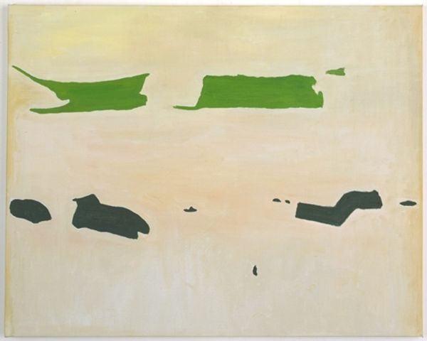
Esteban Vicente made this unnamed print with colour blocks of red and green. You can almost smell the ink, right? It's that kind of print. The red kind of seeps in, doesn't it? There's a looseness to the way the colour meets, like watercolor almost. The green on the other hand is heavy, dense, a mass in the center. There's a roughness there, especially on the edges, a real sense of the hand. It's kind of like a landscape, or a map; it's really hard to say. What is so great about this piece is you can decide that for yourself. Think of a Philip Guston, but with a calm. A calm brought out by Vicente’s great approach to the red and green and the balance it makes with the white ground. The ambiguity gives the work such life, doesn't it?
Comments
No comments
Be the first to comment and join the conversation on the ultimate creative platform.
More like this