acrylic-paint, impasto
#
abstract-expressionism
#
abstract expressionism
#
acrylic-paint
#
impasto
#
acrylic on canvas
#
abstraction
#
abstract art
#
modernism
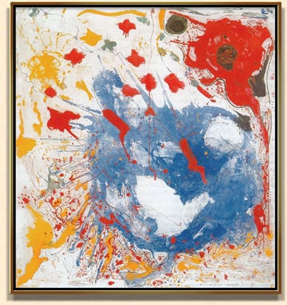
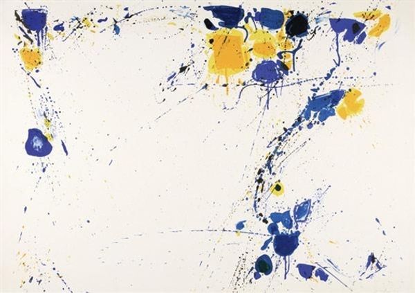
Copyright: 2012 Sam Francis Foundation, California / Artists Rights Society (ARS), NY
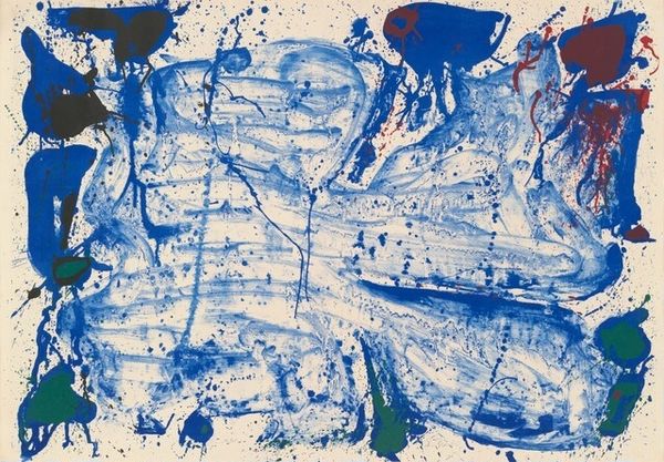
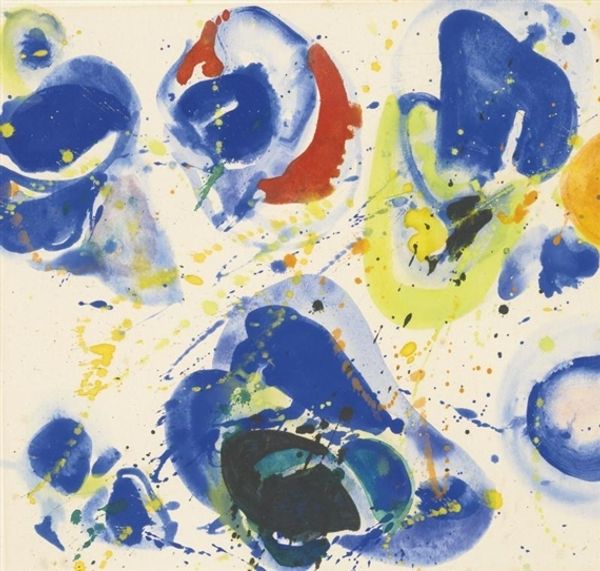
Curator: We're standing before Sam Francis's "Happy Death Stone," created in 1960 using acrylic paint and with a visible impasto technique. Editor: Well, I am immediately struck by its paradoxical energy. "Happy Death" seems contradictory, but the energetic splashes of blues and reds give it a vital, chaotic feel. It almost feels like the explosive end of something. Curator: The title certainly introduces a layer of contemplation to the abstract form. Do you think that paradox reflects something deeper about the human experience and the ways we understand mortality? We tend to avoid discussing the topic openly. Editor: Perhaps. Given its materiality, it makes me wonder about the physical process. Did he work quickly? What tools did he use to get these dripping effects? It almost seems as if he abandoned control of the paint itself, to an extent. It really challenges notions of careful artistic application, and almost hints that maybe this work was accidental in many ways. Curator: Francis's approach connects to Abstract Expressionism, doesn’t it? The style favors conveying inner emotional realities through color and dynamic form. We see the exploration of these themes—both life and the acknowledgement of death or loss. The imagery is left undefined, to prompt each viewer's individual projection onto the work. Editor: And speaking to the period, in terms of process—acrylics allowed for that quick layering, that impulsive application and response in a very different way than oils, for instance. The easy consumption and accessible nature of acrylics at that time really speaks to a larger movement in which art creation opened up. Curator: Absolutely. In looking closer, these blues evoke peace, don’t they? Then juxtaposed with those spots of intense red… there’s a struggle implied, between contentment and perhaps pain. Editor: Right—the balance of cool and hot materials. The negative space becomes active, as it contrasts heavily against those dense areas around the border. Almost, like the paint becomes contained and limited. What do you make of that? Curator: Well, after spending this time thinking, I recognize a tension that pulls between opposing forces… the bounded vs. the unbounded, happiness vs. loss, mortality vs. life... I think he wants the viewer to accept this complexity. Editor: I would agree! A piece of art so reliant on specific historical and technological context, made possible and affordable materials... it creates, within itself, even further complex discussions.
Comments
No comments
Be the first to comment and join the conversation on the ultimate creative platform.
More like this