painting, print, watercolor, engraving
dutch-golden-age
painting
landscape
watercolor
cityscape
genre-painting
engraving
watercolor
Dimensions: height 163 mm, width 278 mm
Copyright: Rijks Museum: Open Domain
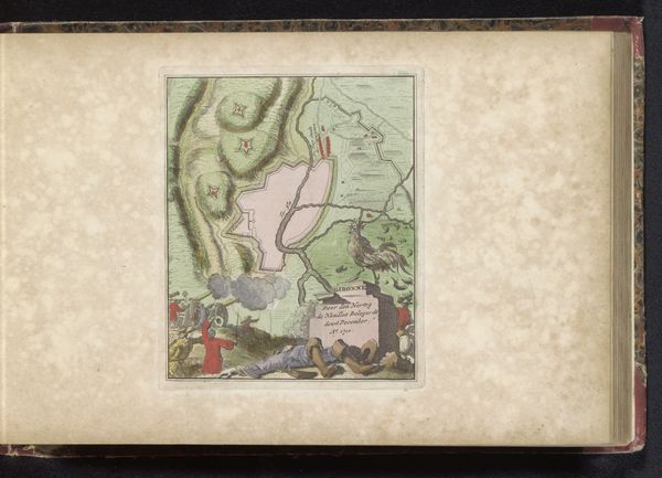
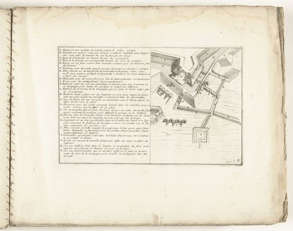
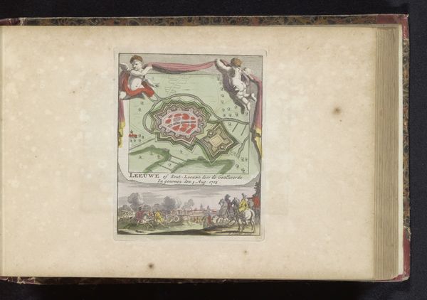
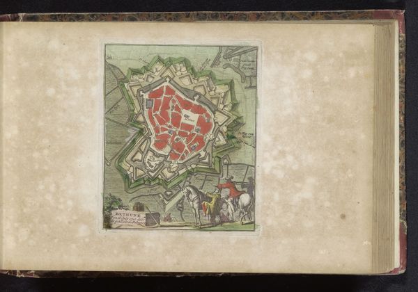
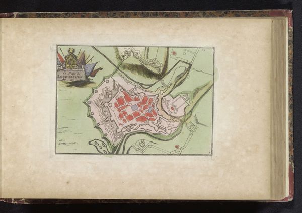
Curator: Here we have what appears to be an image from a bound book, a print of the “Plattegrond van Fort Knoque,” which translates to “Map of Fort Knoque.” It's difficult to determine the exact date, but it's estimated to be from somewhere between 1700 and 1735, made by an anonymous Dutch Golden Age artist. What strikes you when you first see it? Editor: Oh, a real duality! It’s almost as if this piece is saying, "Here's the plan," then immediately following with, "And here's what goes terribly wrong.” My eyes go immediately to that second section. It is dynamic and visually engaging with bodies flung about on the ground. It definitely suggests that it wasn’t all just neat, gridded lines on the map. Curator: Precisely! The left side of the print depicts the meticulously planned-out fort and its surrounding landscape as an almost architectural drawing, employing watercolor and engraving. It showcases the cool, rational approach to military strategy and engineering typical of the era, doesn’t it? The other vignette presents genre painting depicting the consequences and very realistic impact on people's lives! Editor: The colors feel symbolic too; everything on the 'rational' left is tinted with practical blues, greens, and grays. It shows planning, industry and a more cerebral focus. But that panel on the right absolutely pops with blood oranges, yellows, even purples from the bruising. So the colors highlight chaos, passion, visceral reactions to conflict, I would suggest! I also find myself strangely drawn to that solitary donkey in the space between those images...almost a visual note. Curator: Good point! Yes, the donkey feels like a bridge, or maybe a melancholic witness between these realms. Perhaps that donkey alludes to the burdens of war and suffering for all. What else might the donkey point towards? Editor: Well, it also reminds me that no matter how precisely you map something, war always involves unpredictability and, often, unexpected suffering... and maybe this humble creature just stands in for that silent majority. Curator: I love that. So, what appears at first to be a technical diagram reveals itself to be a commentary on the lived experience and impact of war? Editor: Exactly! I think it beautifully reminds us that plans, strategies, and diagrams are only ever one side of a much bigger, and far more emotionally charged, story. Curator: An eloquent reminder that resonates across time, beautifully articulated. Thank you!
Comments
No comments
Be the first to comment and join the conversation on the ultimate creative platform.
More like this