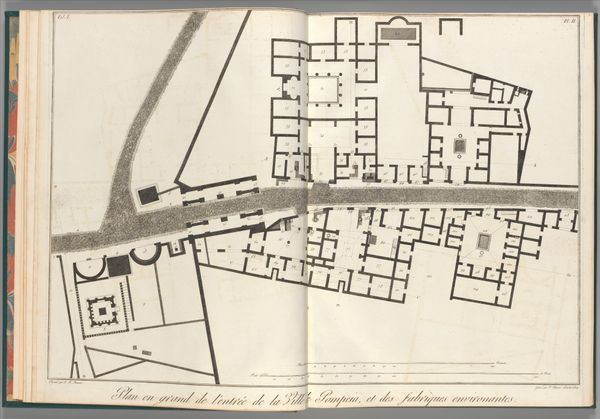
painting, print, watercolor, engraving
#
baroque
#
painting
# print
#
landscape
#
watercolor
#
coloured pencil
#
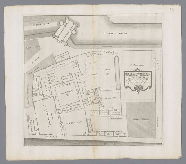
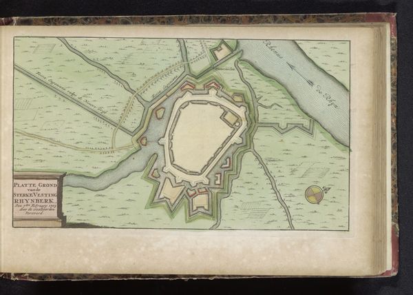
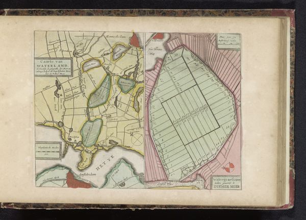
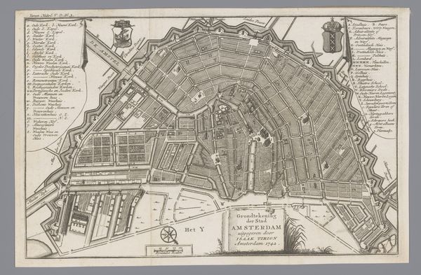
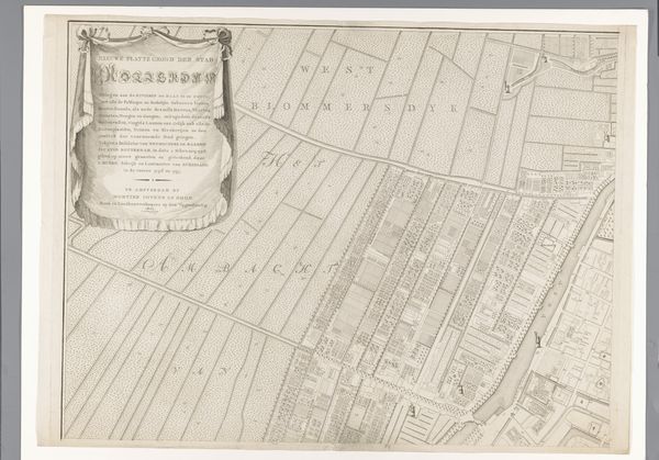
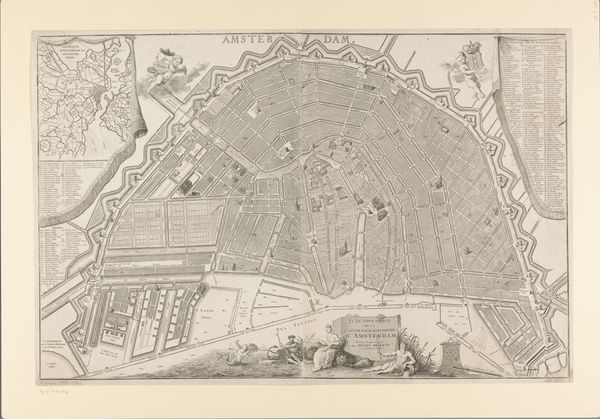
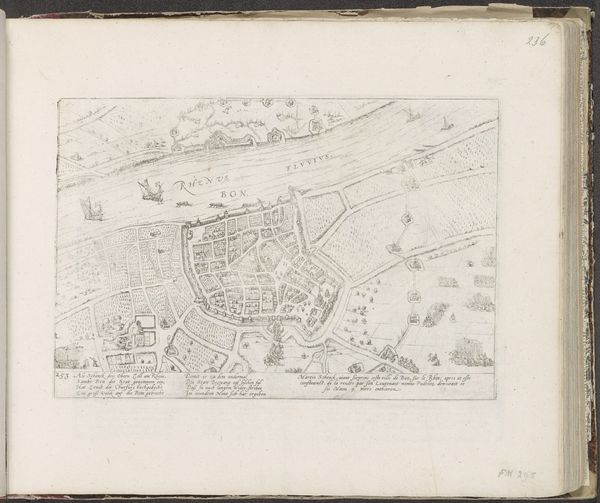
cityscape
#
watercolour illustration
#
engraving
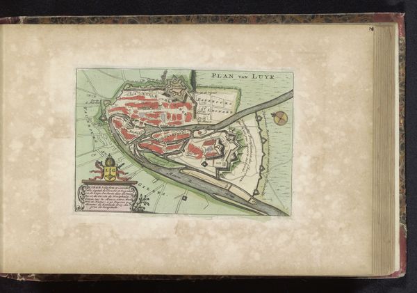
Dimensions: height 170 mm, width 250 mm
Copyright: Rijks Museum: Open Domain
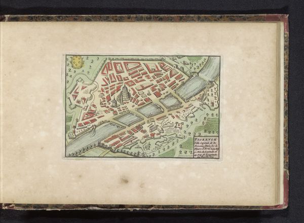
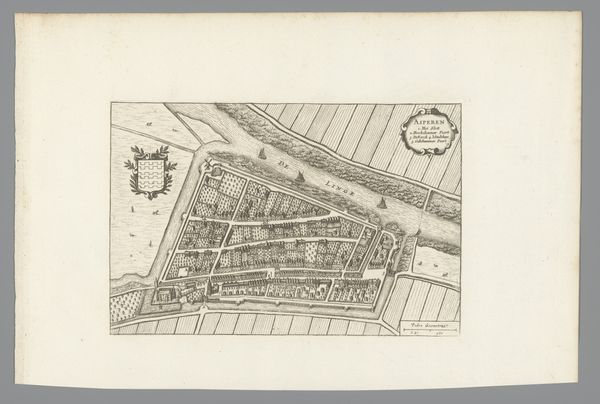
Curator: This meticulously rendered "Plattegrond van Danzig, 1734," dating to around 1735, offers us a fascinating window into both cartography and early urban studies. I'm immediately struck by the detail and the tension it holds between precision and artistic expression. Editor: It has a compelling graphic quality! The crisp lines and flat planes remind me of textiles – perhaps embroidered linens, considering the period and possible context of creation and domestic use. The layout of the surrounding fields speaks to organized labor, and even social class. Curator: Exactly. The division of land – and who controlled it – plays into complex power dynamics. These maps served practical functions, of course, delineating territories, aiding in navigation. But the projection used reveals much about societal viewpoints: notice, for example, the position of Danzig within what's implied is the 'known world' at that time. It reinforces a Eurocentric worldview. Editor: Looking at how the print was constructed physically, it seems as though they first laid in a watercolor base for the landmasses, the river deltas, and then engraved over it with these very distinct geometric patterns. Everything points to resources and how they are harvested. Consider even the production of the pigments themselves – from where did these supplies come? Curator: That materiality is very important. The engraver’s painstaking process speaks to a broader culture of meticulous record-keeping that existed in the service of empire-building and commercial power, for certain. But even considering its composition –the very top half is literally water– there is this clear delineation between man-made structure versus that of natural formation. What can you say about the color and its application? Editor: Well, look how the urban center just *bursts* into brilliant reds, visually claiming primacy. The sharp angles depicting agriculture are carefully calculated to bring attention to the city's central, commanding position for its own purposes: wealth and industry. The use of vibrant, bold color certainly is meant to create hierarchy. This was a product made with skilled, meticulous handwork in the print and the die itself. The details showcase the artist and how much this print was probably worth upon completion of its many-layered processes! Curator: Your points really ground it in its tangible existence, in the who, how, and why of it all. For me, I leave contemplating the very act of attempting to compress the complex, organic reality of a bustling city into a simplified, controlled representation of itself – the impulse toward power and control it reveals. Editor: And for me, it reinforces just how maps shape not just physical territories, but mental landscapes too.
Comments
No comments
Be the first to comment and join the conversation on the ultimate creative platform.
More like this