drawing, ornament, paper, watercolor, ink
#
drawing
#
ornament
#
paper
#
watercolor
#
ink
#
islamic-art
#
decorative-art
Copyright: Rijks Museum: Open Domain
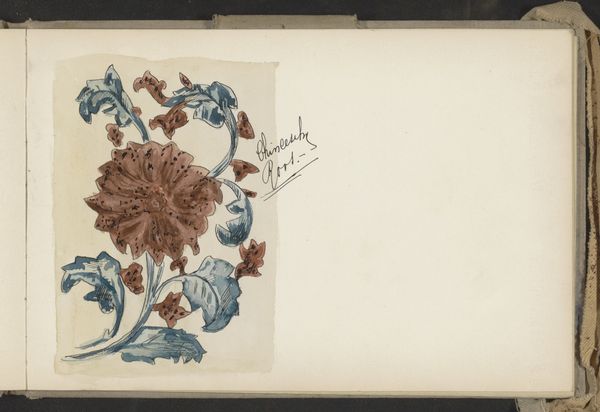
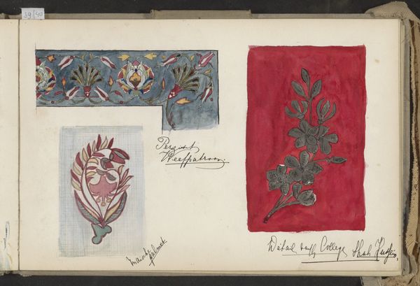
This page of studies, ‘Plafondversiering, Arabisch lijnornament en een arabesk’, was made by Johanna van de Kamer, probably in the late 19th or early 20th century. It looks like she was working out some ideas, maybe for a design project, using watercolour. The way she's handled the medium here is interesting – it's quite controlled, the paint thinly applied and the colours muted, apart from the shock of bright red in the floral border. It's like she's trying to understand the structure of these patterns, rather than just copying them. Look at how the lines in the 'Arabisch lijnornament' overlap. It's not just about the finished design, but about how the design is constructed. It reminds me a bit of Hilma af Klint’s notebooks, where she was working through ideas, and breaking things down into component parts. It’s this sense of art as an ongoing conversation, and not just a fixed statement, that really appeals to me. There are no definitive meanings here.
Comments
No comments
Be the first to comment and join the conversation on the ultimate creative platform.
More like this