Perzisch weefpatroon en een Indiaas of Indonesisch palmet en bloemornament c. 1890 - 1922
0:00
0:00
drawing, paper
#
drawing
#
asian-art
#
paper
#
coloured pencil
#
line
#
decorative-art
Copyright: Rijks Museum: Open Domain
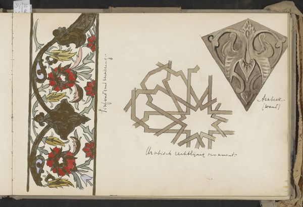
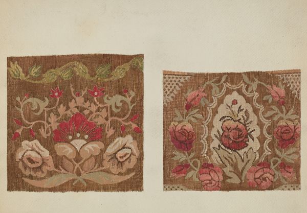
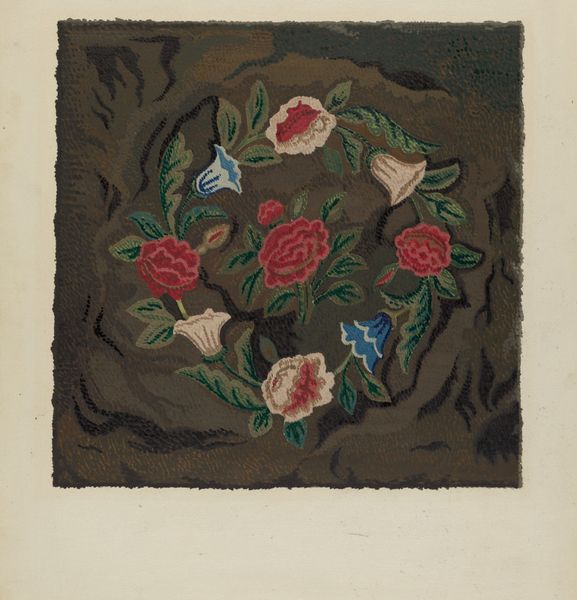
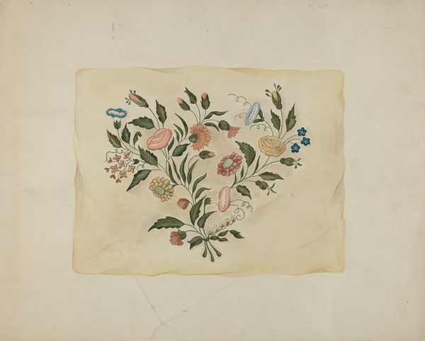
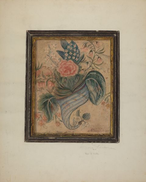
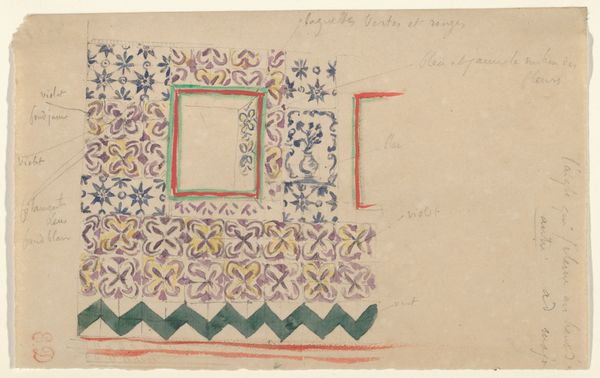
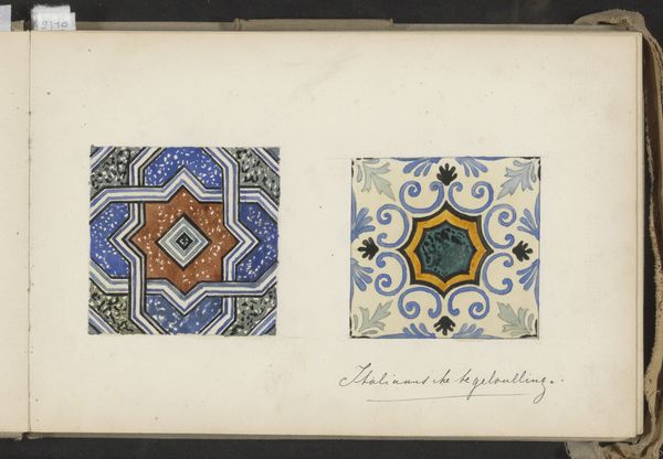
Sometime around the turn of the last century, Johanna van de Kamer made this study of textile patterns with pencil and watercolour. You can see the hand of the artist in the washes of color, layered to create these intricate designs. Look at the red swatch on the right; it's built up from layers of transparent watercolor, a really physical application of color that stain the paper. But the silver-grey motif laid on top is opaque, the application is flatter. The way the artist has worked with the materials emphasizes a tension between flatness and depth. The weave pattern on the upper left has the quality of a frieze. I love how the artist uses blues and greens to cool the composition, in contrast to the warmer reds and golds. It reminds me of Sonia Delaunay's textiles, which also borrow from non-western traditions. Like Delaunay, Johanna van de Kamer lets the process guide her and shows us the beautiful possibilities of color and form.
Comments
No comments
Be the first to comment and join the conversation on the ultimate creative platform.
More like this