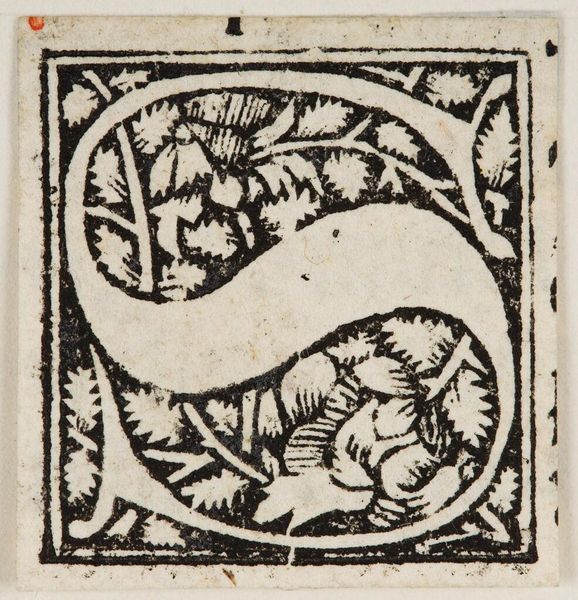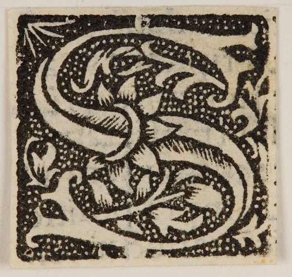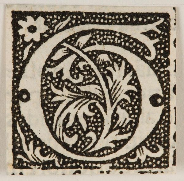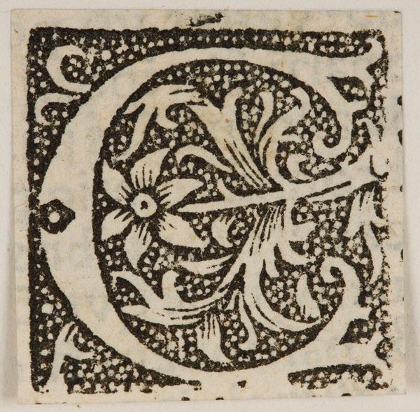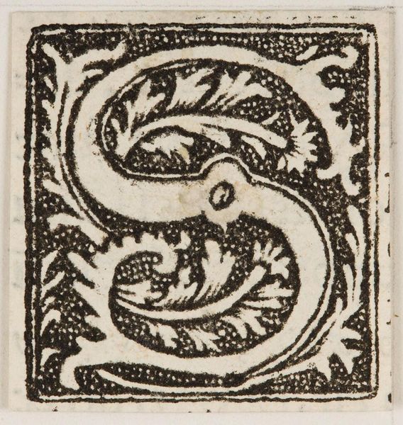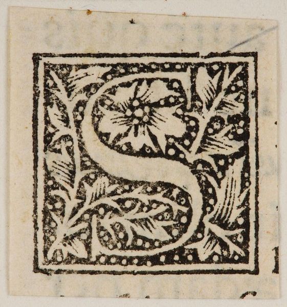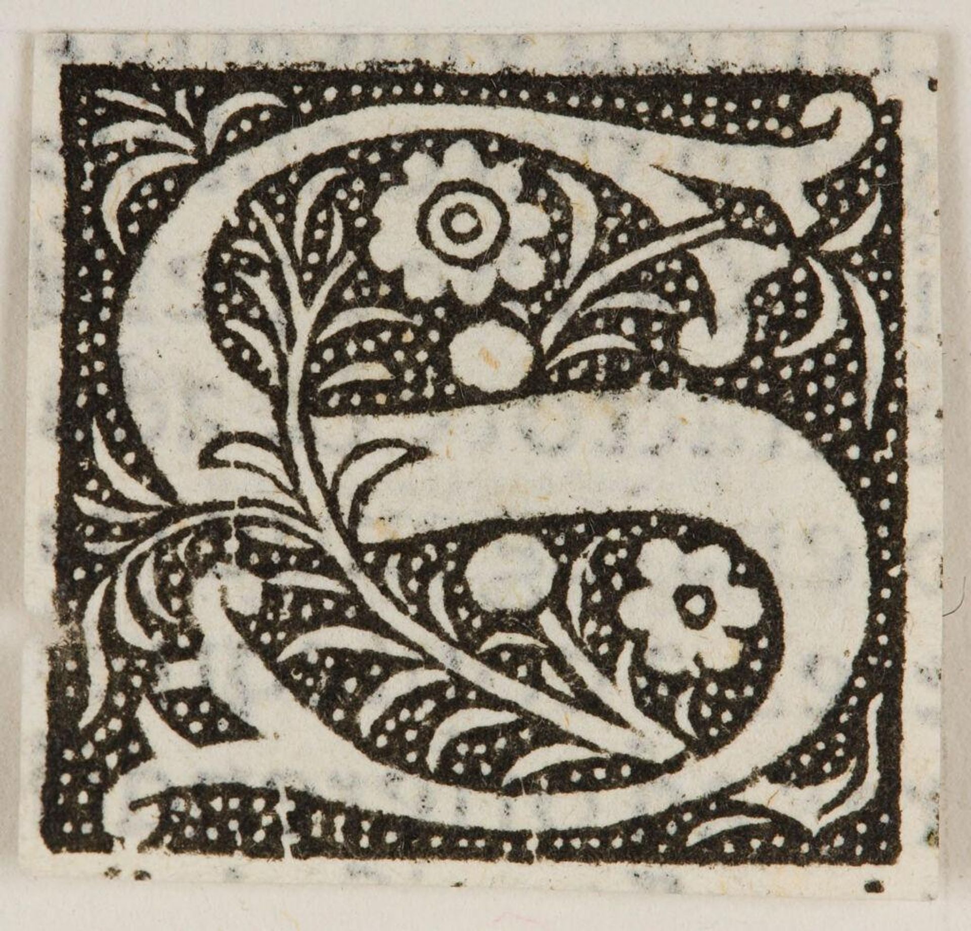
c. 16th century
Letter S
Listen to curator's interpretation
Curatorial notes
Curator: This is a rather lovely 'Letter S'—an initial from an unknown artist, held here at the Harvard Art Museums. It strikes me as both decorative and purposeful. Editor: It's captivating! The high contrast and dense ornamentation give it a striking graphic quality. The black and white contrast is very effective. Curator: Indeed. The anonymous creator likely intended it for use in a larger text, perhaps a manuscript, to signal the start of a chapter or verse, thus acting as a visual cue for the reader. Editor: The floral motifs intertwined with the letterform are quite charming. Note the stippled background enhancing the shape of the ‘S’ which reads clearly, despite the embellishments. Curator: It speaks to the cultural importance of literacy, where even the smallest components of text were thoughtfully designed and imbued with artistic merit. Editor: It's remarkable how such a simple letter, through its visual design, takes on symbolic importance. It is both decorative and purposeful, as you say. Curator: Precisely, and studying it allows us a glimpse into the values placed on aesthetics and communication in its time. Editor: I'll certainly be looking at initial letters with a fresh perspective from now on.