Copyright: CC0 1.0
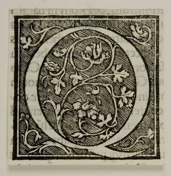
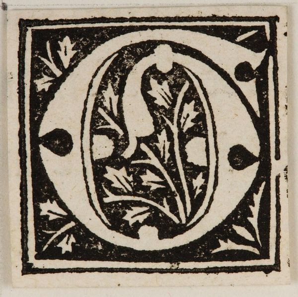
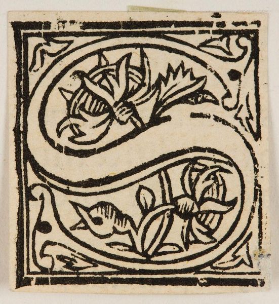
Editor: Here we have an anonymous piece titled "Letter Q." What immediately strikes me is the intricate, almost frenetic interplay between the letterform and the organic, floral design surrounding it. What compositional elements do you find most compelling? Curator: The tension between the geometric frame and the curvilinear forms within is certainly noteworthy. Observe how the artist uses the positive space of the letter itself to contain the negative space created by the floral design, producing a visually arresting figure-ground relationship. The density of the pattern suggests a kind of horror vacui. Editor: Horror vacui, that’s interesting. I wouldn't have thought about the fear of empty space. How does that relate to the overall design? Curator: It directs our reading of the surface. The consistent texture discourages the eye from resting, emphasizing the overall pattern rather than any single element. We are left contemplating the act of mark-making itself. Editor: That's a fresh perspective on what I initially saw as just a decorative letter. I see the visual texture in a different light now. Curator: Indeed, understanding the interplay between form and surface allows us to appreciate the artist's choices and the visual language they employ.
Comments
No comments
Be the first to comment and join the conversation on the ultimate creative platform.
More like this