Copyright: CC0 1.0
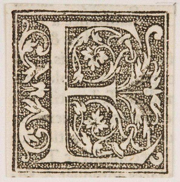
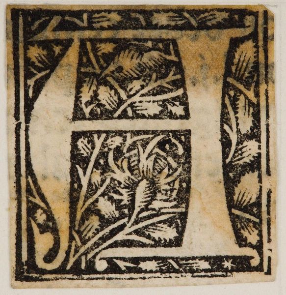
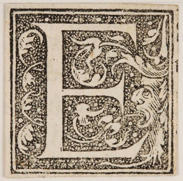
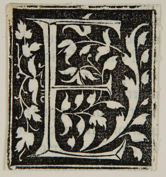
Editor: Here we have an anonymous artwork titled "Letter F". It's quite striking how the letter is embellished with organic forms. What do you notice about the composition of this piece? Curator: The stark contrast between the black ink and the white ground immediately commands attention. Observe how the botanical motifs intertwine with the geometric structure of the letterform, creating a visually arresting tension between nature and order. Editor: That's a great point! It seems like there is an intentional juxtaposition. How do you think that tension contributes to the overall design? Curator: The tension invites contemplation on the relationship between the symbolic function of the letter and the decorative impulse. The textures, though simple, add depth. Editor: I see. It makes you think about the basic form and its decoration in a new way. Thanks! Curator: Indeed. It's a reminder that even within seemingly simple designs, lies layers of complex formal relationships.
Comments
No comments
Be the first to comment and join the conversation on the ultimate creative platform.
More like this