Copyright: CC0 1.0
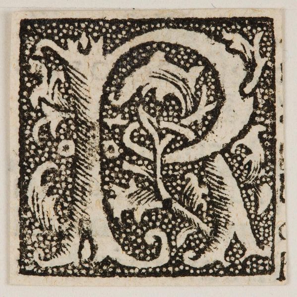
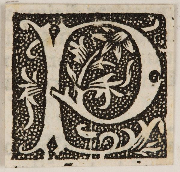
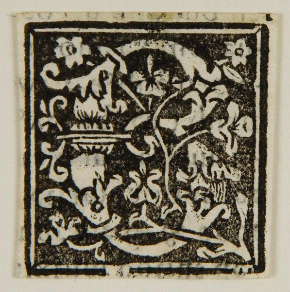
Editor: Here we have an initial "P", made by an anonymous artist. It has a somewhat medieval feel to it, doesn't it? What strikes you most about the composition? Curator: The density of the forms, both organic and geometric, creates a tension. Note the counterpoint between the sharp corners and the swirling foliate designs. The black field defines the white space, giving equal weight to both. Editor: So, it's about the interplay between the shapes, not necessarily the letter itself? Curator: Precisely. One could argue the letter is merely a structural armature for a more complex arrangement of forms and textures. Did you notice the tiny arrow detail? Editor: No, I missed that completely! I guess there's more to this letter than meets the eye. Curator: Indeed. The piece reveals a fascinating dialogue between representation and abstraction.
Comments
No comments
Be the first to comment and join the conversation on the ultimate creative platform.
More like this