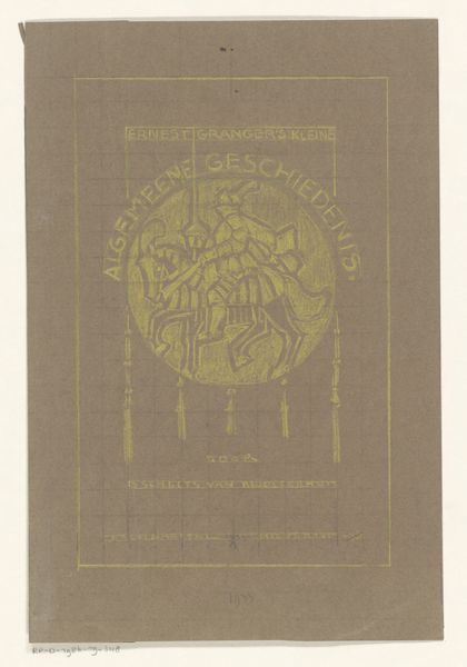
Omslag voor: Kunst en kunstleven geïllustreerde periodiek voor het algemeen kunstwezen 1911 - 1912
0:00
0:00
graphic-art, print, textile, paper, typography, poster
#
graphic-art
#
art-nouveau
# print
#
textile
#
paper
#
typography
#
linocut print
#
poster
Dimensions: height 284 mm, width 495 mm
Copyright: Rijks Museum: Open Domain
This is the cover for an illustrated periodical for the general art world, rendered in gentle, soothing green. Look at how the designer used thin lines to create the whole framework around the text. It’s a great way to produce a border without using a thick, dominating stroke. It feels almost like a delicate cage, with flowers and leaves dancing around the words. That choice of colour is crucial. It's not punchy or aggressive but subtle. The green feels like it is whispering "art," which, in turn, makes the text feel more important than the design. This approach reminds me of El Lissitzky, who wasn’t afraid to keep things simple so that the message shines through. Art is often about seeing what others have missed. We are all in conversation with each other, across time and place, and that's something to celebrate.
Comments
No comments
Be the first to comment and join the conversation on the ultimate creative platform.
More like this