graphic-art, print, textile, typography
#
graphic-art
#
aged paper
#
script typography
#
neoclassicism
# print
#
old engraving style
#
hand drawn type
#
textile
#
personal sketchbook
#
typography
#
hand-drawn typeface
#
stylized text
#
thick font
#
handwritten font
#
columned text
Copyright: Rijks Museum: Open Domain
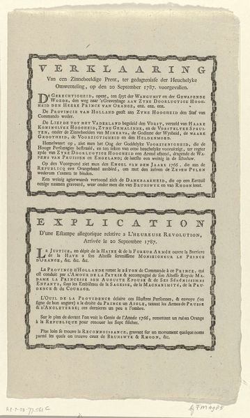
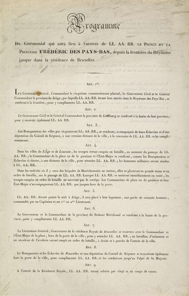
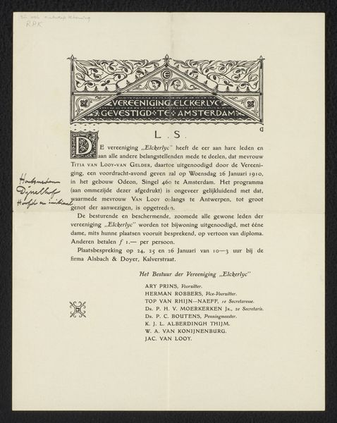
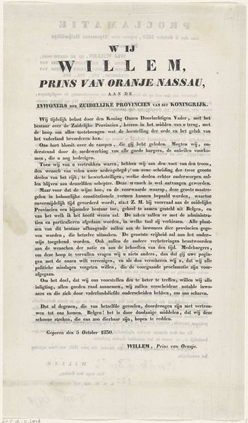
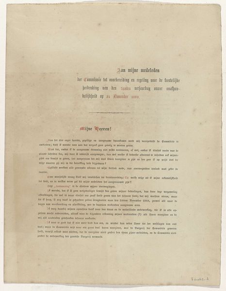
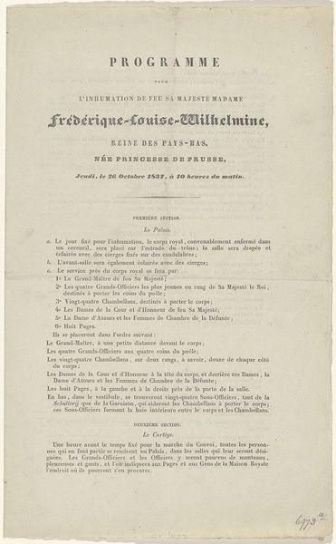
Curator: This is an announcement for an exhibition, titled "Programma van de Tentoonstelling van Schilderijen, Teekeningen, Gravures en Beeldhouwkunst," or "Program for the Exhibition of Paintings, Drawings, Engravings, and Sculpture." It likely dates to 1817. Editor: It has an aged, almost delicate presence. The texture gives a somber and historical feel, immediately highlighting its vintage origin. The typography also seems pretty stylized, quite thick for what I would expect from a contemporary font. Curator: Precisely. The announcement provides regulations for artists submitting their work, inviting all painters, engravers, sculptors, and architects in the Netherlands to participate. We must consider the socio-political context of art production. Here, the announcement embodies an institutional power dynamic and the very mechanism through which artistic talent is selected, valued, and exhibited. Editor: That’s a wonderful observation! I see those hierarchies in its very composition. The balance between text blocks creates an equilibrium but the leading title is very prominent—demanding the immediate focus. Even without understanding the Dutch, it communicates the announcement’s importance in design alone. The neoclassical style employed reflects a commitment to order and rationality. Curator: The specific stipulations—the manner of packaging, deadlines, size restrictions, and a requirement for a detailed account of the artist’s name, address, and pricing—are deeply telling. These regulations construct an artistic environment, determining who can participate and on what terms. I am quite curious about J. Hari who signs off as secretary, they were undoubtedly deeply involved with cultural bureaucracy. Editor: The serifs in this typeface are elegantly assertive, suggesting precision and an intentional calligraphic inspiration, reinforcing the text’s serious undertones. The layout demonstrates a keen awareness of spatial dynamics. The document seems visually articulate as much as textually. Curator: Its survival underscores its historical significance. The "Programma" grants us insights into art world mechanisms, revealing standards for production and access and speaking volumes about structures of the art academy and cultural norms of the period. Editor: And visually speaking, the interplay of its design communicates order through typographic harmony. I leave with an appreciation for the intersection of its vintage appeal and restrained artistic expression.
Comments
No comments
Be the first to comment and join the conversation on the ultimate creative platform.
More like this