Dimensions: height 44 mm, width 26 mm
Copyright: Rijks Museum: Open Domain
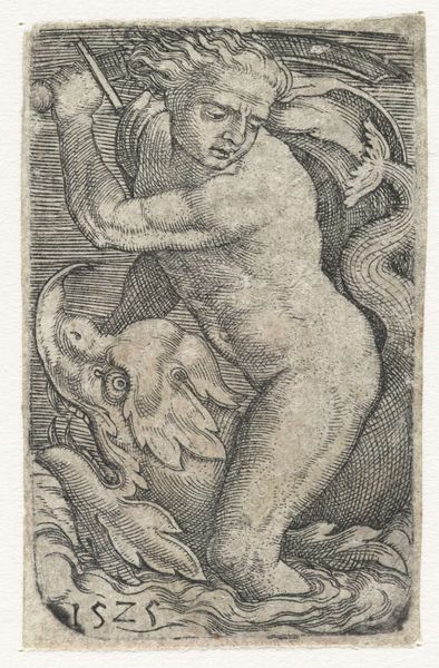
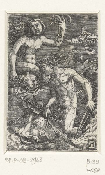
Editor: We’re looking at "Seagod on Dolphin" by Barthel Beham, made around 1525 using engraving. The figure's stern expression contrasts with the playful dolphin, creating an intriguing tension. What strikes you most about the visual dynamics in this print? Curator: Observe how Beham has utilized a sophisticated system of hatching to construct form and shadow. Notice, for example, the density of lines defining the musculature of the torso in contrast to the relatively sparse treatment of the background. Consider how this treatment pushes the figure forward, enhancing its imposing presence. Do you find that the contrast serves a purely descriptive purpose, or something more? Editor: I think the stark contrasts amplify the dramatic effect; the detailed lines on the god make him almost tangible against the abstract background. What do you make of the almost ornamental use of lines? Curator: Note the controlled chaos of the hair. Lines are organized to express texture while adhering to the overall rhythmic scheme. This calculated asymmetry, counter-posed against the geometric exactitude elsewhere, injects visual excitement, guiding our eye through the composition. Would you agree that it’s these formal tensions that hold the viewer’s gaze? Editor: Yes, definitely. Thinking about the composition like that clarifies why this print feels so compelling. Curator: Indeed. Attending to these formal strategies, we move beyond representational concerns to address the essential aesthetic construction of meaning in the work. Editor: That's given me a new appreciation for the artist's intent! Thank you!
Comments
No comments
Be the first to comment and join the conversation on the ultimate creative platform.
More like this